Correlation-Matrix
Here is a step-by-step instruction to turn any pandas DataFrame of numeric columns into a “correlation-matrix” chart using LightningChart Python:
Using Rectangle Series
1. Load and prepare your data
-
Read your CSV into a
pandas.DataFrame. -
Select just the columns you want to correlate (e.g.
sensor_cols = ['T24','T30',…]). -
Compute the correlation matrix:
corr_matrix = df[sensor_cols].corr().values
2. Create the chart
import lightningchart as lc

chart = lc.ChartXY(
    title="Correlation Matrix",
    theme=lc.Themes.Light
)
3. Draw each cell as a colored rectangle
Loop over all row/column pairs (i,j) and:
-
Create a new rectangle-series:
rect_series = chart.add_rectangle_series() -
Add the rectangle spanning
[j, j+1] x [i, i+1]:rect = rect_series.add(x1=j, y1=i, x2=j+1, y2=i+1) -
Pick its fill color based on the correlation value (e.g. via a helper
get_correlation_color(corr_matrix[i][j])).
4. Label the axes with your variable names
-
Hide default numeric ticks:
x_axis = chart.get_default_x_axis().set_tick_strategy("Empty")
y_axis = chart.get_default_y_axis().set_tick_strategy("Empty") -
Set the axis ranges to cover all cells:
x_axis.set_interval(0, len(sensor_cols))
y_axis.set_interval(0, len(sensor_cols)) -
Add custom ticks at each “half-cell” (so labels sit in the middle):
for idx, label in enumerate(sensor_cols):
    x_axis.add_custom_tick().set_value(idx+0.5).set_text(label).set_tick_label_rotation(90)
    y_axis.add_custom_tick().set_value(idx+0.5).set_text(label)
5. (Optional) Overlay the numeric correlation values
If you want to show the exact coefficient in each box:
for i in range(N):
    for j in range(N):
        val = corr_matrix[i,j]
        txt = chart.add_textbox(
            x=j+0.5, y=i+0.5, text=f"{val:.2f}"
        )
        txt.set_origin("Center")
        # choose white/black for contrast
        color = "white" if abs(val)>0.6 else "black"
        txt.set_text_fill_style(color)
6. Finally, show the chart
chart.open()
import lightningchart as lc
import pandas as pd
import numpy as np
# Set your license key
lc.set_license('my-license-key')
# Load data
df = pd.read_csv("Path to dataset")
# Select sensor columns
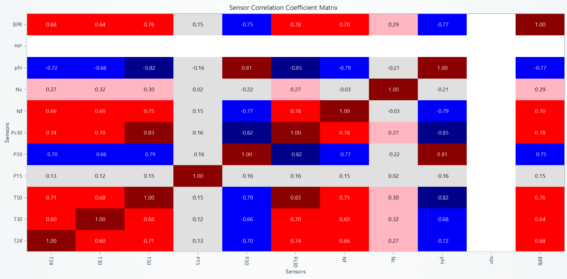
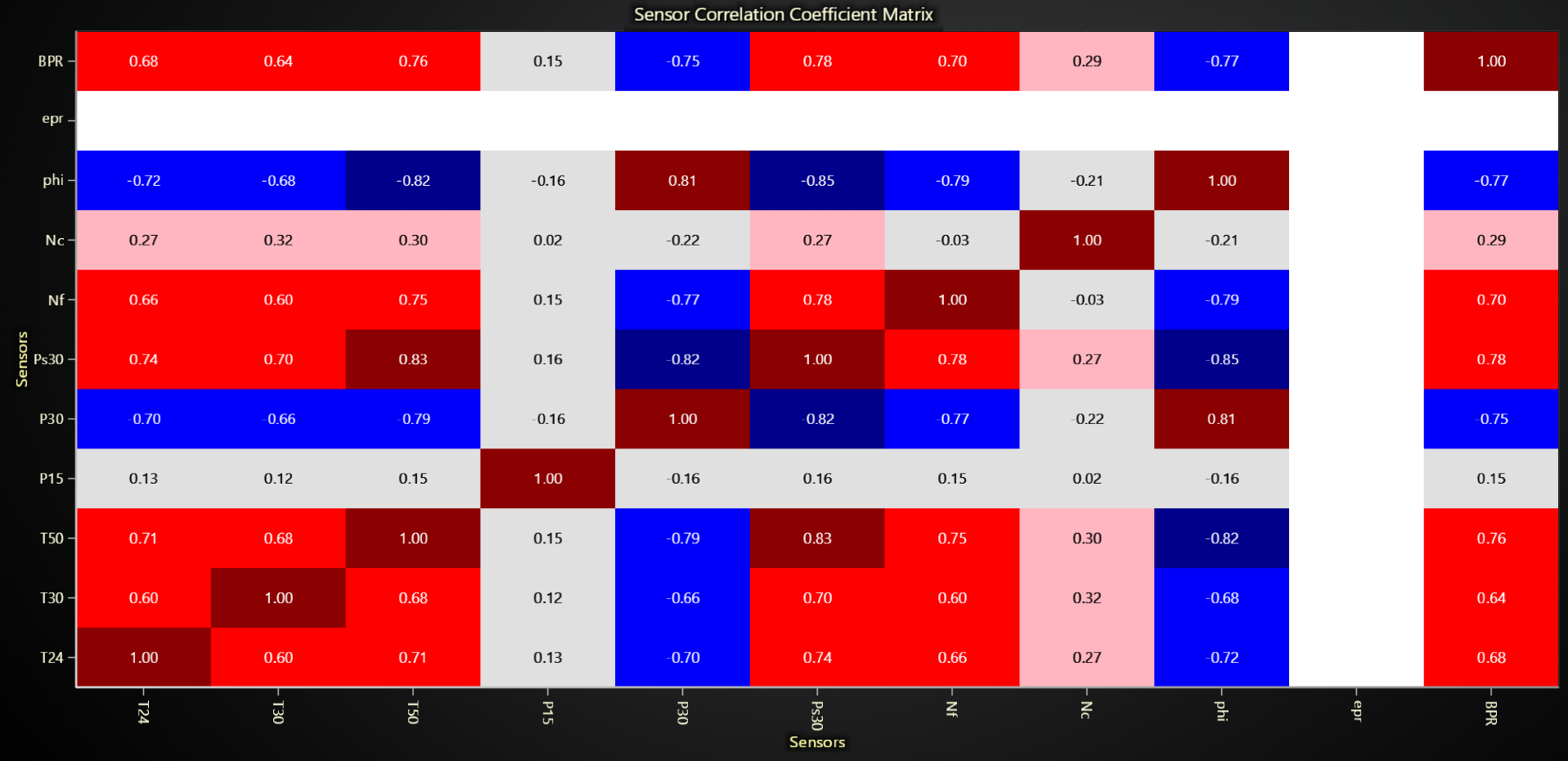
sensor_cols = ['T24', 'T30', 'T50', 'P15', 'P30', 'Ps30', 'Nf', 'Nc', 'phi', 'epr', 'BPR']
# Calculate correlation matrix
corr_matrix = df[sensor_cols].corr().values
# Create chart
correlation_chart = lc.ChartXY(title="Sensor Correlation Coefficient Matrix Heatmap", theme=lc.Themes.Light)
# Function to get color based on correlation value
def get_correlation_color(corr_val):
if np.isnan(corr_val):
return (255, 255, 255) # white for missing values
if corr_val >= 0.8:
return (139, 0, 0) # darkred
elif corr_val >= 0.6:
return (255, 0, 0) # red
elif corr_val >= 0.4:
return (255, 165, 0) # orange
elif corr_val >= 0.2:
return (255, 182, 193) # lightpink
elif corr_val >= -0.4:
return (224, 224, 224) # lightgray
elif corr_val >= -0.6:
return (173, 216, 230) # lightblue
elif corr_val >= -0.8:
return (0, 0, 250) # blue
else:
return (0, 0, 139) # darkblue
# Create individual rectangles for each cell
for i in range(len(sensor_cols)):
for j in range(len(sensor_cols)):
corr_value = corr_matrix[i][j]
# Create rectangle series for this cell
rect_series = correlation_chart.add_rectangle_series()
# Add rectangle
rect = rect_series.add(x1=j, y1=i, x2=j+1, y2=i+1)
rect.set_color(get_correlation_color(corr_value))
# Configure axes
x_axis = correlation_chart.get_default_x_axis()
y_axis = correlation_chart.get_default_y_axis()
x_axis.set_title("Sensors")
y_axis.set_title("Sensors")
x_axis.set_tick_strategy("Empty")
y_axis.set_tick_strategy("Empty")
# Add custom ticks
for i, label in enumerate(sensor_cols):
custom_tick_x = x_axis.add_custom_tick().set_tick_label_rotation(90)
custom_tick_x.set_value(i + 0.5)
custom_tick_x.set_text(label)
custom_tick_y = y_axis.add_custom_tick()
custom_tick_y.set_value(i + 0.5)
custom_tick_y.set_text(label)
# Set axis intervals
x_axis.set_interval(0, len(sensor_cols))
y_axis.set_interval(0, len(sensor_cols))
# Add correlation values as text
for i in range(len(sensor_cols)):
for j in range(len(sensor_cols)):
x_center = j + 0.5
y_center = i + 0.5
corr_value = corr_matrix[i][j]
text = f"{corr_value:.2f}"
text_box = correlation_chart.add_textbox(x=x_center, y=y_center, text=text)
text_box.set_origin("Center")
# Determine text color based on correlation value
if abs(corr_value) > 0.6 or np.isnan(corr_value):
text_box.set_text_fill_style(("white"))
else:
text_box.set_text_fill_style(("black"))
text_box.set_background_color((0, 0, 0, 0))
text_box.set_stroke(0, color=(0, 0, 0, 0))
text_box.set_text_font(15)
# Open chart
correlation_chart.open(method='browser')
You could also use Heatmap instead of Rectangle series as well based on the following example:
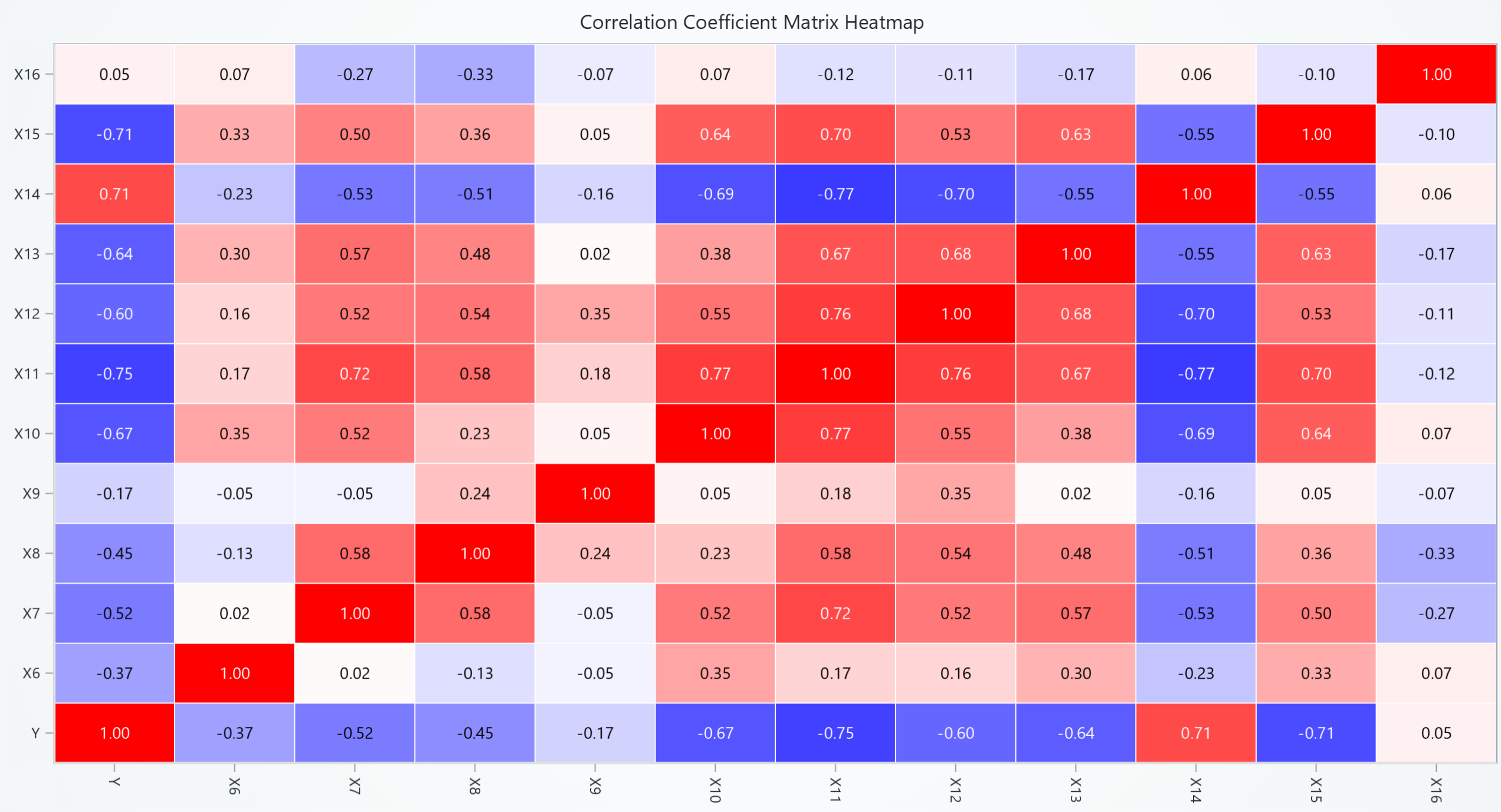
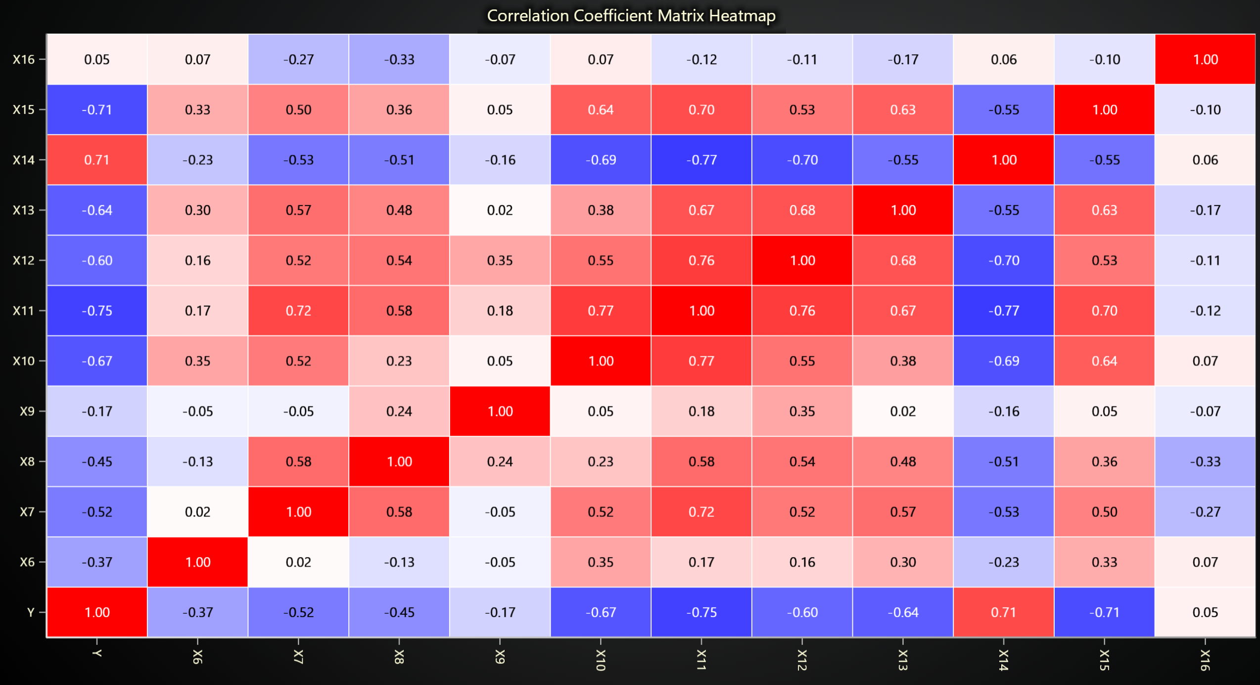
import lightningchart as lc
import pandas as pd
import numpy as np

# Set your license key
lc.set_license('my-license-key')

# Load data
df = pd.read_csv("Path to dataset")

# Select only numeric columns
numeric_data = df.select_dtypes(include=['float64', 'int64'])

# Calculate correlation for numeric columns
correlation_matrix = numeric_data.corr()

# Convert correlation matrix to a numpy array
correlation_array = correlation_matrix.to_numpy()

# Extract column names for labeling
labels = correlation_matrix.columns

chart = lc.ChartXY(
    title="Correlation Heatmap for Numerical Features",
    theme=lc.Themes.Dark
)

# Set up the heatmap grid
grid_size_x, grid_size_y = correlation_array.shape
heatmap_series = chart.add_heatmap_grid_series(
    columns=grid_size_x,
    rows=grid_size_y,
)

# Configure heatmap properties
heatmap_series.set_start(x=0, y=0)
heatmap_series.set_end(x=grid_size_x, y=grid_size_y)
heatmap_series.set_step(x=1, y=1)
heatmap_series.set_wireframe_stroke(thickness=1, color=('white'))
heatmap_series.invalidate_intensity_values(correlation_array.tolist())
heatmap_series.set_intensity_interpolation(False)

# Define color palette for correlation
palette_steps = [
    {"value": -1, "color": ('blue')},
    {"value": 0, "color": ('white')},
    {"value": 1, "color": ('red')}
]
heatmap_series.set_palette_coloring(
    steps=palette_steps,
    look_up_property='value',
    interpolate=True
)

# Set up axes
x_axis = chart.get_default_x_axis()
y_axis = chart.get_default_y_axis()
x_axis.set_tick_strategy('Empty')
y_axis.set_tick_strategy('Empty')

# Add labels for both axes
for i, label in enumerate(labels):
    custom_tick_x = x_axis.add_custom_tick().set_tick_label_rotation(90)
    custom_tick_x.set_value(i + 0.5)
    custom_tick_x.set_text(label)

    custom_tick_y = y_axis.add_custom_tick()
    custom_tick_y.set_value(i + 0.5)
    custom_tick_y.set_text(label)

for i in range(len(labels)):
    for j in range(len(labels)):
        x_center = j + 0.5
        y_center = i + 0.5
        corr_value = correlation_matrix.iloc[i, j]
        text = f"{corr_value:.2f}"

        text_box = chart.add_textbox(x=x_center, y=y_center, text=text)
        text_box.set_origin("Center")

        # Determine text color based on correlation value
        if abs(corr_value) > 0.6 or np.isnan(corr_value):
            text_box.set_text_fill_style(("white"))
        else:
            text_box.set_text_fill_style(("black"))

        text_box.set_background_color((0, 0, 0, 0))
        text_box.set_stroke(0, color=(0, 0, 0, 0))
        text_box.set_text_font(15)

chart.open()