Cursor
LightningChart Python provides powerful built-in cursor functionality (CursorXY / Cursor2D / Cursor3D) that activates when users place their mouse over a chart. The cursor displays contextual information about data points, series, and chart components, enhancing data exploration and analysis.
Cursor Control Methods
Cursors can be controlled in two primary ways:
- Built-in cursor modes — Automatic hover/nearest/pointed logic controlled by the chart
- Manual cursors — Created with
chart.add_cursor()for full programmatic control
Built-in Cursor Modes
Cursor modes define how the cursor targets and displays data. Each mode offers different interaction behaviors:
Available Cursor Modes
| Mode | Description |
|---|---|
"show-nearest" | Show the nearest value to reference location |
"show-nearest-interpolated" | Show the nearest interpolated value to reference location |
"show-pointed" | Shows the exact pointed value (directly under user pointer) |
"show-pointed-interpolated" | Shows the pointed interpolated value (directly under user pointer) |
"show-all" | Displays values from all trackables simultaneously. |
"show-all-interpolated" | Shows interpolated values from all trackables simultaneously. |
"disabled" | Completely disables the cursor |
Setting Cursor Modes
# Enable cursor with different targeting modes
chart.set_cursor_mode("show-nearest")          # show one series (nearest)
chart.set_cursor_mode("show-all")              # show all series at once
chart.set_cursor_mode("show-nearest-interpolated")  # with interpolation
chart.set_cursor_mode("disabled")              # disable cursor

# Access the cursor instance for further customization
cursor = chart.set_cursor()                    # Returns Cursor instance
cursor.set_visible(True)
cursor.set_auto_fit(True)

# Check current cursor mode
current_mode = chart.get_cursor_mode()
print(f"Current cursor mode: {current_mode}")
Per-Series Cursor Control
You can enable or disable cursor interaction for individual series:
# Create series
series1 = chart.add_line_series()
series2 = chart.add_line_series()

# Disable cursor for specific series
series1.set_cursor_enabled(False)  # Cursor will ignore this series

# Check cursor state for a series
is_enabled = series2.get_cursor_enabled()
- Cursor visibility can be affected by hover/activation behavior in auto-cursor modes.
- For large datasets (millions of points), use
"show-pointed"instead of nearest-search modes for better performance. - Interpolated modes provide smoother cursor feedback but may not reflect actual data values.
- Use
chart.set_cursor_enabled_during_axis_animation(False)to disable cursor during zoom/pan for improved responsiveness.
Point Marker Customization
The point marker is the visual indicator that appears on data points when the cursor is active. Customize its appearance to match your chart's branding or UX requirements.
Basic Point Marker Configuration
cursor = chart.set_cursor()

cursor.set_point_marker(
    shape="triangle",           # Shape: 'circle', 'square', 'triangle', 'diamond', 'cross', 'plus', 'star'
    size=18,                   # Size in pixels (or tuple for width/height)
    fill_color="#25D219",      # Fill color
    stroke_thickness=2,        # Border thickness
    stroke_color="#F10B0B",    # Border color
    rotation=15,               # Rotation in degrees
    visible=True,              # Show/hide marker
    origin={'x': 1, 'y': 1},  # Anchor point [-1, 1], 0 is center
    pointer_events=True,       # Enable mouse interactions
)

# Get current visibility state
is_visible = cursor.get_point_marker_visible()

# Hide/show point marker
cursor.set_point_marker_visible(False)
Available Point Marker Shapes
| Shape | Description |
|---|---|
'circle' | Round marker (default) |
'square' | Square marker |
'triangle' | Triangular marker |
'diamond' | Diamond-shaped marker |
'cross' | Cross/X-shaped marker |
'plus' | Plus/+-shaped marker |
'star' | Star-shaped marker |
Advanced Size and Positioning
cursor.set_point_marker(
    size={'x': 20, 'y': 30},      # Different width and height
    origin={'x': -1, 'y': 0},      # Position relative to data point
    margin={'left': 5, 'right': 5, 'top': 3, 'bottom': 3}  # Margin around marker
)
Dynamic Cursor Behavior
Automatically match cursor styling to hovered series properties:
# Match cursor style to series data
chart.set_cursor_dynamic_behavior(
    match_point_marker_shape=True,           # Match series marker shape
    point_marker_fill='match-data',          # Use series color
    point_marker_stroke={'color': 'match-data', 'thickness': 2},
    point_marker_size=(15, 15)
)

# Disable dynamic behavior
chart.set_cursor_dynamic_behavior(None)  # disabled
Listening to Point Marker Events
Add interactive behavior by listening to pointer events on the cursor marker:
def on_cursor_click(event):
    client_pos = event.get('client')
    print(f"Cursor marker clicked at: {client_pos}")

cursor.set_point_marker(
    shape="circle",
    size=15,
    pointer_events=True,  # Required for events
    event_listeners=[
        {
            "event": "click",
            "handler": on_cursor_click,
            "throttle_ms": 100,  # Optional: minimum delay between events
            "once": False         # Optional: auto-remove after first trigger
        }
    ]
)
Supported Point Marker Events
| Event | Description |
|---|---|
'click' | Single click on marker |
'dblclick' | Double click on marker |
'pointerdown' | Mouse button pressed |
'pointerup' | Mouse button released |
'pointerenter' | Pointer enters marker area |
'pointerleave' | Pointer leaves marker area |
'pointermove' | Pointer moves over marker |
'wheel' | Mouse wheel scrolled over marker |
Complete Event Listener Example
cursor.set_point_marker(
    shape="star",
    size=20,
    fill_color="#FFD700",
    pointer_events=True,
    event_listeners=[
        {
            "event": name,
            "handler": lambda ev, n=name: print(f"[cursor] {n} at {ev.get('client')}")
        }
        for name in ["click", "pointerdown", "pointerup",
                     "pointerenter", "pointerleave", "pointermove", "wheel"]
    ]
)
- Each handler receives an
eventdict containing DOM coordinates viaevent.get('client') - Use
"throttle_ms": 100to limit event frequency (useful forpointermove) - Set
"once": Trueto automatically remove the listener after first trigger pointer_eventsmust beTruefor events to work (automatically enabled whenevent_listenersare provided)
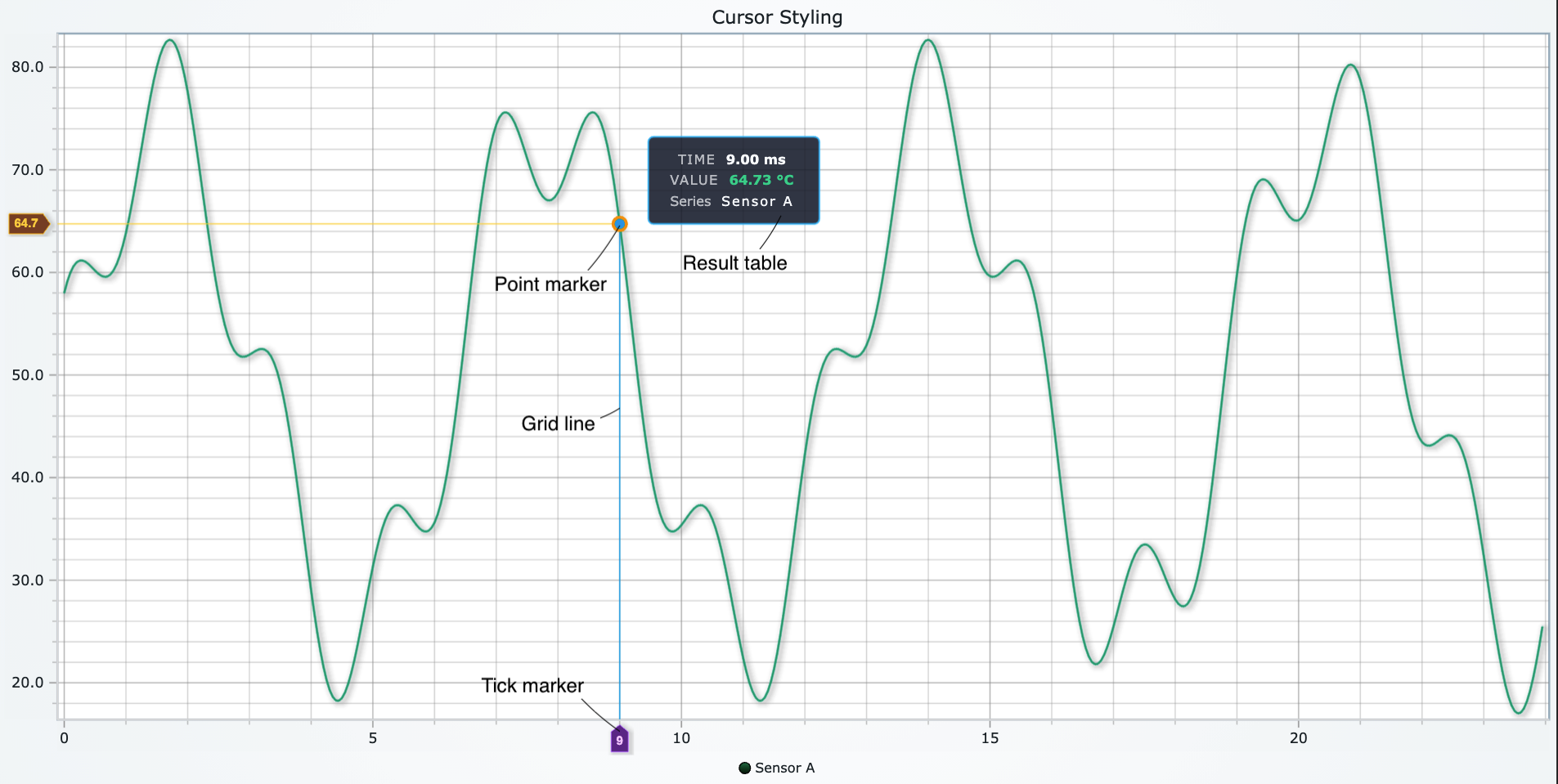
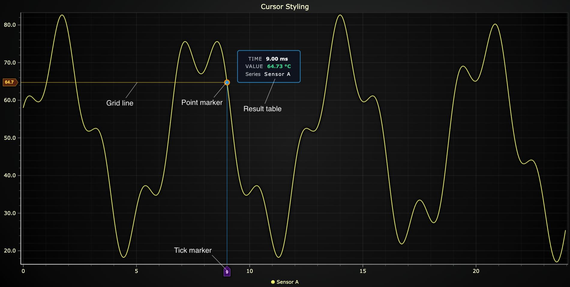
Result Table Configuration
The result table is the tooltip that displays data values and information when the cursor is active. Fully customize its appearance, positioning, and content.
Basic Result Table Styling
cursor = chart.set_cursor()

cursor.set_result_table(
    origin={'x': -1, 'y': -1},              # Position relative to cursor
    padding=10,                              # Internal padding
    margin=6,                                # External margin
    text_color="#CB1818",                    # Text color
    font_size=11,                            # Font size in pixels
    font_family="Arial, sans-serif",         # Font family
    font_weight="bold",                      # Font weight
    font_style="normal",                     # Font style
    background_fill_color="#3385BF",         # Background color
    background_stroke_thickness=1,           # Border thickness
    background_stroke_color="#C71BA7",       # Border color
    background_corner_radius=8,              # Rounded corners
    visible=True,                            # Show/hide table
    effect=False,                            # Disable theme effects
)

# Check result table visibility
is_visible = cursor.get_result_table_visible()

# Toggle visibility
cursor.set_result_table_visible(True)
Result Table Positioning
The origin parameter controls where the result table appears relative to the cursor:
# Position table to top-left of cursor
cursor.set_result_table(origin={'x': -1, 'y': -1})

# Position table to bottom-right
cursor.set_result_table(origin={'x': 1, 'y': 1})

# Center the table on cursor
cursor.set_result_table(origin={'x': 0, 'y': 0})

# Position with tuples
cursor.set_result_table(origin=(0.5, -1))  # Centered horizontally, above cursor
| Origin X | Position (Horizontal) |
|---|---|
-1 | Left of cursor |
0 | Centered |
1 | Right of cursor |
| Origin Y | Position (Vertical) |
|---|---|
-1 | Above cursor |
0 | Centered |
1 | Below cursor |
Auto-fit Behavior
Enable auto-fit to keep the result table within visible chart boundaries:
# Enable auto-fit (keeps table in view)
cursor.set_auto_fit(True)

# Check auto-fit state
is_autofit = cursor.get_auto_fit()
Result Table Padding and Margin
cursor.set_result_table(
    # Uniform padding on all sides
    padding=10,

    # Or specify individual sides
    padding={'left': 15, 'right': 15, 'top': 10, 'bottom': 10},

    # Margin (space between table and cursor point)
    margin={'left': 8, 'right': 8, 'top': 5, 'bottom': 5}
)
CursorXY Grid Lines and Tick Markers
For XY charts, customize the cursor's crosshair grid lines and axis tick markers to integrate seamlessly with your chart design.
Grid Line Styling
Control the appearance of the vertical and horizontal cursor lines:
cursor = chart.set_cursor()

# Style X grid line (vertical)
cursor.set_grid_stroke_x_style(thickness=2, color="red")

# Style Y grid line (horizontal)
cursor.set_grid_stroke_y_style(thickness=1, color="#00aa00")

# Get current grid styles
x_style = cursor.get_grid_stroke_x_style()  # Returns {'thickness': 2, 'color': '...'}
y_style = cursor.get_grid_stroke_y_style()  # Returns {'thickness': 1, 'color': '...'}
Grid Line Cutting
Control whether grid lines are "cut" (interrupted) at the data point:
# Enable/disable grid line cutting
cursor.set_grid_stroke_x_cut(False)  # Continuous line
cursor.set_grid_stroke_y_cut(True)   # Line cut at data point

# Check cut state
x_cut = cursor.get_grid_stroke_x_cut()  # Returns bool
y_cut = cursor.get_grid_stroke_y_cut()  # Returns bool
Cursor Boundary and Space Allocation
Control cursor behavior relative to axis boundaries:
# Keep cursor within axis boundaries
cursor.set_keep_within_axis_boundaries(True)
is_constrained = cursor.get_keep_within_axis_boundaries()

# Control whether tick markers allocate space on axes
cursor.set_tick_markers_allocate_axis_space(False)
allocates_space = cursor.get_tick_markers_allocate_axis_space()
Axis Tick Marker Styling
Independently style the X and Y axis tick markers that display cursor values:
# Style X-axis tick marker
cursor.set_tick_marker_x(
    text_color="#FFFFFF",
    text_rotation=-45,                  # Rotate text
    font_family="Courier New",
    font_size=10,
    font_weight="bold",
    font_style="italic",
    margin=4,                           # Margin around tick
    background_fill_color="#CB1818",    # Background color
    background_stroke_thickness=1,       # Border thickness
    background_stroke_color="#C71BA7",  # Border color
    visible=True,
)

# Style Y-axis tick marker
cursor.set_tick_marker_y(
    text_color="#00FF00",
    font_size=12,
    font_weight="normal",
    background_fill_color="#333333",
    background_stroke_thickness=2,
    background_stroke_color="#FFFFFF",
    visible=True,
)

# Control tick marker visibility individually
cursor.set_tick_marker_x_visible(True)
cursor.set_tick_marker_y_visible(False)

# Check visibility
x_visible = cursor.get_tick_marker_x_visible()
y_visible = cursor.get_tick_marker_y_visible()
Complete CursorXY Configuration Example
chart = lc.ChartXY()
chart.set_cursor_mode("show-nearest")
cursor = chart.set_cursor()

# Configure grid lines
cursor.set_grid_stroke_x_style(thickness=1, color="#FF6B6B")
cursor.set_grid_stroke_y_style(thickness=1, color="#4ECDC4")
cursor.set_grid_stroke_x_cut(True)
cursor.set_grid_stroke_y_cut(True)

# Configure tick markers
cursor.set_tick_marker_x(
    text_color="#FFFFFF",
    font_size=11,
    font_weight="bold",
    background_fill_color="#FF6B6B",
    background_stroke_thickness=1,
    background_stroke_color="#000000",
    margin={'left': 6, 'right': 6, 'top': 3, 'bottom': 3}
)

cursor.set_tick_marker_y(
    text_color="#000000",
    font_size=11,
    font_weight="bold",
    background_fill_color="#4ECDC4",
    background_stroke_thickness=1,
    background_stroke_color="#000000",
    margin=5
)

# Boundary settings
cursor.set_keep_within_axis_boundaries(True)
cursor.set_tick_markers_allocate_axis_space(False)
Cursor3D Tick Styling
3D cursors support the same cursor modes as XY charts, including "show-nearest", "show-pointed", and other targeting modes. Configure tick marker styling for the X, Y, and Z axes.
Styling All Axes at Once
Use set_ticks() to apply styling to all three axes (X, Y, Z) simultaneously:
chart = lc.Chart3D()
chart.set_cursor_mode("show-pointed")
cursor = chart.set_cursor()

cursor.set_ticks(
    text_color="#df620e",
    text_rotation=30,
    font_family="Courier New",
    font_size=18,
    font_weight="bold",
    font_style="italic",
    text_padding=4,                     # Padding around text
    tick_length=20,                     # Length of tick line
    tick_stroke_color="#e0e01a",        # Tick line color
    tick_stroke_thickness=4,            # Tick line thickness
    background_fill_color="#123d95",    # Background color
    background_stroke_color="#e01aa5",  # Border color
    background_stroke_thickness=2,      # Border thickness
    padding={"left": 24, "right": 6, "top": 4, "bottom": 4},
)
Styling Individual Axes
Override specific properties for individual axes:
# Style X-axis tick
cursor.set_tick_x(
    font_size=16,
    tick_length=14,
    text_color="#FF0000",
    background_fill_color="#330000"
)

# Style Y-axis tick
cursor.set_tick_y(
    text_color="#00FFAA",
    font_size=14,
    tick_stroke_color="#00FF00",
    tick_stroke_thickness=2
)

# Style Z-axis tick
cursor.set_tick_z(
    background_fill_color="#222222",
    background_stroke_color="#FFFFFF",
    background_stroke_thickness=1
)
Tick Parameters Reference
| Parameter | Type | Description |
|---|---|---|
text_color | Color | Color of tick text |
text_rotation | float | Rotation angle in degrees |
font_size | float | Font size in pixels |
font_family | str | Font family name |
font_weight | str | Font weight ('normal', 'bold', etc.) |
font_style | str | Font style ('normal', 'italic') |
text_padding | float | Padding around text |
tick_length | float | Length of tick line in pixels |
tick_stroke_thickness | float | Thickness of tick line |
tick_stroke_color | Color | Color of tick line |
background_fill_color | Color | Background fill color |
background_stroke_thickness | float | Background border thickness |
background_stroke_color | Color | Background border color |
padding | int/float/dict | Padding around entire tick component |
Complete 3D Cursor Example
chart = lc.Chart3D()
chart.set_cursor_mode("show-pointed")
cursor = chart.set_cursor()

# Apply base styling to all axes
cursor.set_ticks(
    font_family="Consolas",
    font_size=12,
    font_weight="bold",
    text_padding=5,
    tick_length=15,
    tick_stroke_thickness=2,
    background_stroke_thickness=1,
    padding=5
)

# Customize individual axes with colors
cursor.set_tick_x(
    text_color="#FF5555",
    tick_stroke_color="#FF5555",
    background_fill_color="#330000"
)

cursor.set_tick_y(
    text_color="#55FF55",
    tick_stroke_color="#55FF55",
    background_fill_color="#003300"
)

cursor.set_tick_z(
    text_color="#5555FF",
    tick_stroke_color="#5555FF",
    background_fill_color="#000033"
)

# Configure point marker and result table
cursor.set_point_marker(shape="sphere", size=8, fill_color="#FFFFFF")
cursor.set_result_table(
    visible=True,
    background_fill_color="#1a1a1a",
    text_color="#FFFFFF"
)
Combining with Axis Grid Lines
Extend tick lines across chart planes using axis grid controls:
# Extend grid lines across 3D space
x_axis = chart.get_default_x_axis()
y_axis = chart.get_default_y_axis()
z_axis = chart.get_default_z_axis()

x_axis.set_grid_stroke_length(100)
x_axis.set_grid_stroke_style(thickness=1, color="#555555")

y_axis.set_grid_stroke_length(100)
y_axis.set_grid_stroke_style(thickness=1, color="#555555")

z_axis.set_grid_stroke_length(100)
z_axis.set_grid_stroke_style(thickness=1, color="#555555")
Custom Cursor Formatting
Customize the content and appearance of the cursor result table using formatter callbacks. The formatter receives cursor event data and returns a table structure.
Basic Cursor Formatting
chart.set_cursor_mode("show-nearest")
cursor = chart.set_cursor()

def cursor_formatter(event: dict):
    """Format cursor result table content."""
    hits = event.get("hits", [])

    if not hits:
        return []

    hit = hits[0]
    x_val = float(hit.get("x", 0.0))
    y_val = float(hit.get("y", 0.0))
    name = hit.get("seriesName", "Series")

    return [
        [
            '<span style="opacity:.7;text-transform:uppercase;letter-spacing:.08em;">Time</span>',
            f'<span style="font-weight:700;">{x_val:.2f} ms</span>',
        ],
        [
            '<span style="opacity:.7;text-transform:uppercase;letter-spacing:.08em;">Value</span>',
            f'<span style="color:#34D399;font-weight:700;">{y_val:.2f} °C</span>',
        ],
        [
            '<span style="opacity:.7;">Series</span>',
            f'<span style="letter-spacing:.12em;">{name}</span>',
        ],
    ]

# Apply formatter to chart
chart.set_cursor_formatting(cursor_formatter)

# Get current formatter
current_formatter = chart.get_cursor_formatting()

# Remove formatter (revert to default)
chart.set_cursor_formatting(None)

chart.open(live=True)
Per-Series Custom Formatting
Override cursor formatting for individual series:
series1 = chart.add_line_series()
series2 = chart.add_line_series()

def series_specific_formatter(event: dict):
    """Custom formatter for a specific series."""
    hit = event.get('hit', {})
    i_sample = hit.get('iSample')
    if i_sample is not None:
        return [
            ["Series", "", hit.get("seriesName", "")],
            ["X", "", f"{hit.get('x', 0.0):.2f}"],
            ["Y", "", f"{hit.get('y', 0.0):.2f}"]
        ]

# Set formatter for specific series
series1.set_cursor_formatting_override(series_specific_formatter)

# Check if series has custom formatter
has_override = series1.get_cursor_formatting_override()

# Remove series-specific formatter
series1.set_cursor_formatting_override(None)
Advanced Formatting with HTML Styling
Use inline CSS to style cursor content:
def advanced_formatter(event: dict):
    hits = event.get("hits", [])
    if not hits:
        return []

    hit = hits[0]
    x = hit.get("x", 0)
    y = hit.get("y", 0)
    series_name = hit.get("seriesName", "Unknown")

    # Determine status based on value
    status_color = "#22C55E" if y > 50 else "#EF4444"
    status_text = "HIGH" if y > 50 else "LOW"

    return [
        # Header row with bold styling
        [
            '<span style="font-weight:800;font-size:1.1em;color:#A0AEC0;">DATA POINT</span>',
            ""
        ],
        # X value with units
        [
            '<span style="opacity:0.7;text-transform:uppercase;letter-spacing:0.08em;">Time</span>',
            f'<span style="font-weight:700;font-family:monospace;">{x:.2f}</span> <span style="opacity:0.6;font-size:0.9em;">ms</span>'
        ],
        # Y value with conditional styling
        [
            '<span style="opacity:0.7;text-transform:uppercase;letter-spacing:0.08em;">Value</span>',
            f'<span style="font-weight:700;color:{status_color};">{y:.2f}</span> <span style="opacity:0.6;font-size:0.9em;">°C</span>'
        ],
        # Status indicator
        [
            '<span style="opacity:0.7;">Status</span>',
            f'<span style="padding:2px 8px;background-color:{status_color};color:white;border-radius:3px;font-weight:600;font-size:0.85em;">{status_text}</span>'
        ],
        # Series name
        [
            '<span style="opacity:0.7;">Series</span>',
            f'<span style="letter-spacing:0.12em;font-style:italic;">{series_name}</span>'
        ]
    ]

chart.set_cursor_formatting(advanced_formatter)
Custom Cursor Implementation
For complete control, replace the built-in cursor with a custom implementation:
def custom_cursor_handler(event: dict):
    hits = event.get("hits", [])

    if hits:
        for hit in hits:
            print(f"Hit: {hit.get('seriesName')} at ({hit.get('x')}, {hit.get('y')})")

    # Your custom cursor rendering logic here
    # This completely replaces the built-in cursor

# Set custom cursor handler
chart.set_custom_cursor(
    handler=custom_cursor_handler,
    throttle_ms=50  # Limit update frequency
)

# Remove custom cursor (restore built-in)
chart.set_custom_cursor(None)
Formatting Tips
- Content vs Container: Formatters control text content and inline styles. Use
cursor.set_result_table(...)for container styling (background, padding, borders). - HTML Support: Result table cells support inline HTML and CSS for rich formatting.
- Performance: Use
throttle_msfor custom cursors that update frequently to maintain smooth performance. - Return Format: Formatters should return a list of rows, where each row is a list of cells (strings).
- Error Handling: Always check if
hitsarray exists and has content before accessing data.
Manual Cursors
Manual cursors provide full programmatic control over cursor position and content. Unlike built-in cursor modes, manual cursors don't respond to hover or nearest-point logic — you control everything.
Creating Manual Cursors
# Create a manual cursor
cursor = chart.add_cursor()

# Position the cursor (XY coordinates)
cursor.set_position(x=60, y=60)

# For 3D charts, provide x, y, z coordinates
cursor_3d = chart3d.add_cursor()
cursor_3d.set_position(x=50, y=75, z=100)
Setting Manual Cursor Content
Important: Manual cursors require explicit result table content. The table won't auto-populate from data.
cursor = chart.add_cursor()
cursor.set_position(x=60, y=60)

# REQUIRED: Provide content for the result table
cursor.set_result_table(
    visible=True,
    content=[
        ["X", "60"],
        ["Y", "60"],
        ["Series", "Manual Data"]
    ],
    text_color="#FFFFFF",
    background_fill_color="#FF5500",
    padding=10,
    margin=5
)

# Style the point marker
cursor.set_point_marker(
    shape="triangle",
    size=15,
    fill_color="#FF5500",
    stroke_thickness=2,
    stroke_color="#FFFFFF",
    visible=True
)
Multiple Manual Cursors
Create multiple independent cursors for comparison or annotations:
# First cursor - Red
cursor1 = chart.add_cursor()
cursor1.set_position(x=25, y=50)
cursor1.set_point_marker(shape="circle", size=10, fill_color="#FF0000", visible=True)
cursor1.set_result_table(
    visible=True,
    content=[["Point A", "25"], ["Value", "50"]],
    background_fill_color="#FF0000"
)

# Second cursor - Blue
cursor2 = chart.add_cursor()
cursor2.set_position(x=75, y=80)
cursor2.set_point_marker(shape="square", size=10, fill_color="#0000FF", visible=True)
cursor2.set_result_table(
    visible=True,
    content=[["Point B", "75"], ["Value", "80"]],
    background_fill_color="#0000FF"
)

# Third cursor - Green (hidden result table)
cursor3 = chart.add_cursor()
cursor3.set_position(x=50, y=65)
cursor3.set_point_marker(shape="diamond", size=12, fill_color="#00FF00", visible=True)
cursor3.set_result_table_visible(False)  # Only show marker, no table
Dynamic Manual Cursor Updates
Update manual cursor position and content dynamically:
import lightningchart as lc
import time

chart = lc.ChartXY()
chart.open(live=True)

# Create manual cursor
cursor = chart.add_cursor()
cursor.set_point_marker(shape="circle", size=12, fill_color="#FFD700", visible=True)

# Animate cursor across chart
for x in range(0, 100, 5):
    y = x ** 0.5 * 10  # Square root curve

    # Update position
    cursor.set_position(x=x, y=y)

    # Update result table content
    cursor.set_result_table(
        visible=True,
        content=[
            ["X", f"{x:.1f}"],
            ["Y", f"{y:.1f}"],
            ["Progress", f"{x}%"]
        ],
        background_fill_color="#333333",
        text_color="#FFD700"
    )

    time.sleep(0.1)
Disposing Manual Cursors
Remove manual cursors when no longer needed:
cursor1 = chart.add_cursor()
cursor2 = chart.add_cursor()

# ... use cursors ...

# Remove specific cursor
cursor1.dispose()

# Remove all by disposing the chart
# (built-in cursors and manual cursors will be cleaned up)
chart.dispose()
Manual Cursor Use Cases
Manual cursors are ideal for:
-
Static Annotations: Mark specific points of interest
marker = chart.add_cursor()
marker.set_position(x=peak_x, y=peak_y)
marker.set_result_table(
    visible=True,
    content=[["Peak", f"{peak_y:.2f}"]]
) -
Data Comparison: Show multiple data points simultaneously
cursor_min = chart.add_cursor()
cursor_min.set_position(x=min_x, y=min_val)
cursor_min.set_point_marker(fill_color="#FF0000")

cursor_max = chart.add_cursor()
cursor_max.set_position(x=max_x, y=max_val)
cursor_max.set_point_marker(fill_color="#00FF00") -
Animation & Simulation: Programmatically move cursors to visualize processes
simulation_cursor = chart.add_cursor()
for time_step in simulation_data:
    simulation_cursor.set_position(x=time_step.x, y=time_step.y)
time.sleep(0.05) -
Custom User Interaction: Respond to events and position cursors accordingly
def on_chart_click(event):
    # Get axis coordinates from event
    axis = event.get('axis', {})
    x = axis.get('x')
    y = axis.get('y')

    if x is not None and y is not None:
        manual_cursor.set_position(x=x, y=y)
        manual_cursor.set_result_table(
            visible=True,
            content=[["Clicked at", f"({x:.1f}, {y:.1f})"]]
        )

chart.add_event_listener('click', handler=on_chart_click, target='seriesBackground')
When handling chart events, coordinates are available in nested dictionaries:
- Axis coordinates:
event.get('axis', {}).get('x')andevent.get('axis', {}).get('y') - Screen pixels:
event.get('client', {}).get('clientX')andevent.get('client', {}).get('clientY') - Relative position:
event.get('relative', {}).get('x')andevent.get('relative', {}).get('y')
Always use target='seriesBackground' to get axis coordinates when clicking on the chart data area.
- Position Control: Manual cursors require explicit
set_position()calls. They don't respond toset_cursor_mode(). - Content Required: Result table content must be set via
set_result_table(content=...)or it will remain empty. - Visibility: Use
set_visible(),set_point_marker_visible(), andset_result_table_visible()independently. - Persistence: Manual cursors remain at their set position until moved or disposed.
Cursor Visibility and State Management
Control cursor visibility and retrieve current state information:
Visibility Control
cursor = chart.set_cursor()

# Control overall cursor visibility
cursor.set_visible(True)
is_visible = cursor.get_visible()

# Control point marker visibility
cursor.set_point_marker_visible(True)
marker_visible = cursor.get_point_marker_visible()

# Control result table visibility
cursor.set_result_table_visible(True)
table_visible = cursor.get_result_table_visible()

# Control cursor during axis animations (zoom/pan)
chart.set_cursor_enabled_during_axis_animation(False)
enabled_during_animation = chart.get_cursor_enabled_during_axis_animation()
set_cursor_mode() vs cursor.set_visible()These methods control different layers of cursor behavior:
chart.set_cursor_mode(...) - Controls the auto-cursor system
- Enables/disables hover logic and nearest-point solving
"disabled"= hard off - no cursor behavior at all- Other modes (
"show-nearest", etc.) = auto-cursor system is active
cursor.set_visible(...) - Controls the visibility flag only
- When auto-cursor mode is enabled, the library may override this based on hover/activation
- Useful for:
- Starting hidden, then showing later (UI toggle)
- Manual cursor visibility control
- Hiding specific components while keeping mode logic active
Example - Start hidden, show on demand:
chart.set_cursor_mode("show-nearest")  # Auto-cursor enabled
cursor = chart.set_cursor()
cursor.set_visible(False)              # Start hidden

# Later (e.g., button click)
cursor.set_visible(True)               # Show cursor
To completely disable cursor (no hover, no rendering):
chart.set_cursor_mode("disabled") # Hard off
To keep cursor logic but hide UI elements:
chart.set_cursor_mode("show-nearest")  # Logic still runs
cursor = chart.set_cursor()
cursor.set_point_marker_visible(False) # Hide marker
cursor.set_result_table_visible(False) # Hide tooltip
# Cursor still tracks data, just doesn't render
Cursor State Getters
Retrieve current cursor configuration:
# Get cursor mode
mode = chart.get_cursor_mode()  # Returns: 'show-nearest', 'disabled', etc.

# Get auto-fit state
auto_fit = cursor.get_auto_fit()

# Get visibility states
cursor_visible = cursor.get_visible()
marker_visible = cursor.get_point_marker_visible()
table_visible = cursor.get_result_table_visible()

# For CursorXY - get grid line styles
x_grid_style = cursor.get_grid_stroke_x_style()
y_grid_style = cursor.get_grid_stroke_y_style()

# Get grid cut states
x_cut = cursor.get_grid_stroke_x_cut()
y_cut = cursor.get_grid_stroke_y_cut()

# Get tick marker visibility
x_tick_visible = cursor.get_tick_marker_x_visible()
y_tick_visible = cursor.get_tick_marker_y_visible()

# Get boundary and space settings
within_boundaries = cursor.get_keep_within_axis_boundaries()
allocates_space = cursor.get_tick_markers_allocate_axis_space()