Gauge Chart
Chart for visualizing a single value within an interval. The gauge interval can be adjusted to suit the granularity of the data being visualized.
The gauge bar can be configured to display data over a specific range of angles. This allows for customization of the visual appearance of the gauge, such as whether it covers a full circle or just a segment of it.
Gauge charts can display value indicators on top of the main bar, which are additional intervals superimposed on the main gauge bar. These value indicators can be used to delineate certain thresholds or value ranges of interest in the data.
Creating Gauge Chart
import lightningchart as lc

chart = lc.GaugeChart(theme=lc.Themes.Dark, title='Gauge Chart')
Appearance Customization
Customize the look and layout of your Chart using the following methods.
Title
chart.set_title_color('#3498db')
chart.set_title_font(size=20, weight='bold')
chart.set_title_margin(10)
chart.set_title_rotation(0)
chart.set_title_effect(True)
Padding
Adjusts the space around the chart's plot area.
chart.set_padding(10)  # Uniform padding
chart.set_padding(left=10, top=15)  # Specific sides
chart.set_padding(left=10, top=15, right=20, bottom=25)  # All sides
Background Color
Sets the background fill color of the chart.
chart.set_background_color("#ffffff")
Background Stroke
Defines the border (stroke) around the chart's background.
chart.set_background_stroke(2, "#cccccc")
Angular & Scale Intervals
Control both the shape of the gauge and the numeric range it shows.
# Show just a half-circle gauge from –90° to +90°
chart.set_angle_interval(start=-90, end=90)

# Map the gauge's numeric scale from 0 up to 200
chart.set_interval(start=0, end=200)
- set_angle_interval changes where the arc begins and ends (in degrees).
- set_interval defines what numeric values correspond to the start/end of that arc.
Setting & Animating the Value
Push a new reading into the gauge and let the needle animate.
# Immediately display value 75
chart.set_value(75)
- set_value updates the gauge's displayed number and moves the needle to that position.
Bar Coloring & Styling
Automatic vs. Manual Coloring
Switch between dynamic LUT-driven bar colors or a fixed “normal” color.
# Follow the active indicator's LUT color
chart.set_automatic_bar_coloring(True)

# Or override with a solid blue bar
chart.set_bar_color('#007ACC')
Bar Effects & Gradients
Add a drop-shadow or gradient to make the bar stand out.
# Enable a subtle drop-shadow or theme glow
chart.set_bar_effect(True)

# Apply a gradient fade instead of a solid fill
chart.set_bar_gradient(True)
Bar Stroke & Thickness
Outline the gauge bar or adjust its thickness.
# Draw a 3px black border on the bar
chart.set_bar_stroke(3, 'black')

# Make the bar itself 20px thick
chart.set_bar_thickness(20)
Animations & Glow
Fine-tune how colors animate and add an optional glow behind the bar.
# Animate color changes (speedMultiplier >1 = faster)
chart.set_color_animation(enabled=True, speed_multiplier=2.0)

# Automatically glow with the bar's color at 30% opacity
chart.set_glow_color({'auto': True, 'alpha': 0.3})
# Use explicit glow color
chart.set_glow_color('#0cf10c')
# Disable background glow
chart.set_glow_color(None)
Value Indicators & Gaps
Define colored bands inside the gauge and control their spacing.
# Space of 10px between bar and its indicators
chart.set_gap_between_bar_and_value_indicators(10)
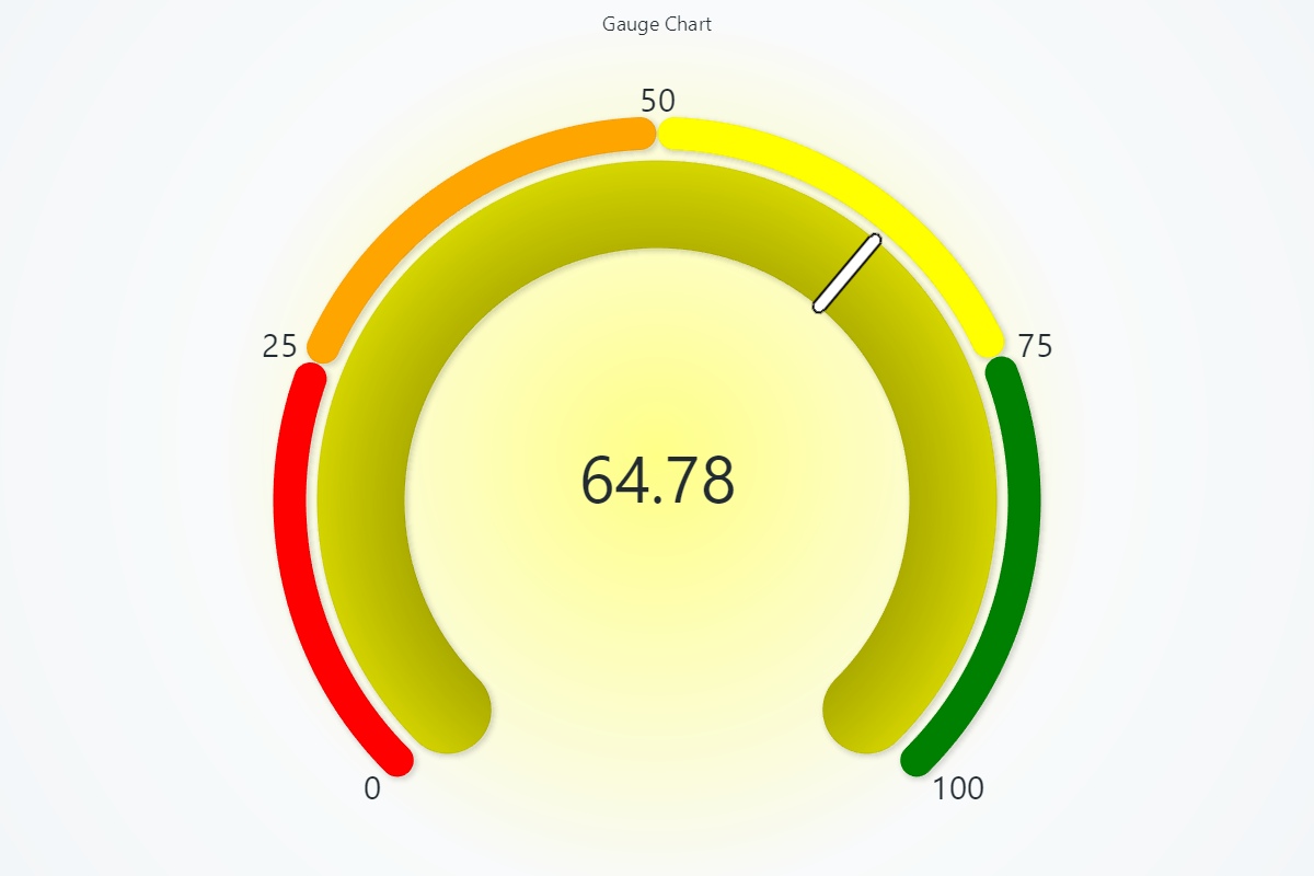
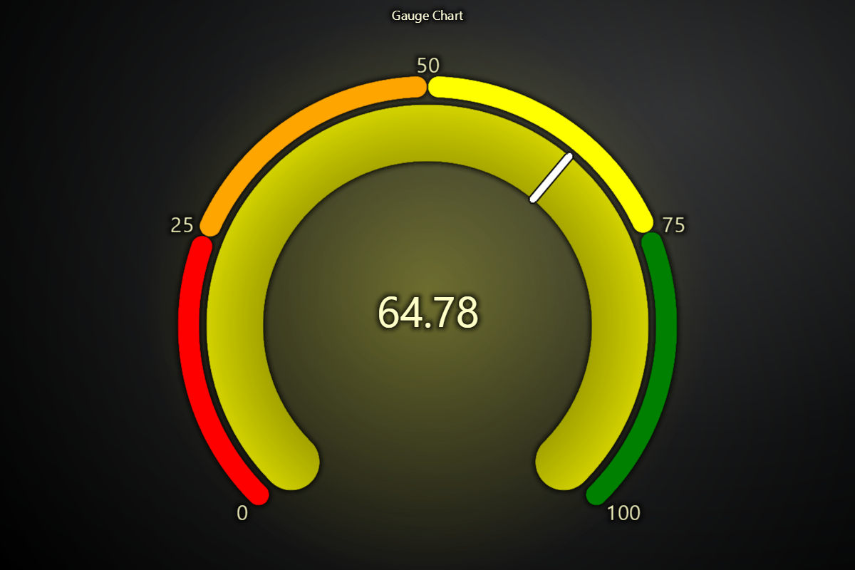
# Color-coded thresholds for safe/warning/danger zones
chart.set_value_indicators(
[
{'start': 0, 'end': 25, 'color': 'red'},
{'start': 25, 'end': 50, 'color': 'orange'},
{'start': 50, 'end': 75, 'color': 'yellow'},
{'start': 75, 'end': 100, 'color': 'green'},
]
)
# Make the value indicator itself 10px thick
chart.set_value_indicator_thickness(10)
Needle Styling
Customize the needle's position, color, length, and border.
# Shift the needle 20% forward (range –1.0 to +1.0)
chart.set_needle_alignment(0.2)

# Solid white needle, 2px thick, 100px long
chart.set_needle_color('white')
chart.set_needle_thickness(2)
chart.set_needle_length(100)

# Outline the needle in dark gray
chart.set_needle_stroke(1, '#333333')
Apply Rounded Edges
# Enable or disable rounded edges for the gauge and value indicators
chart.set_rounded_edges(True)
Ticks, Labels & Units
Control the tick marks, their font, and the unit label.
# Dark-gray tick marks
chart.set_tick_color('#333333')

# Tick font styling
chart.set_tick_font(size=12, family="Verdana", weight="bold")

# Show one decimal place on ticks
chart.set_tick_decimals(1)

# Display a unit label (e.g. “km/h”)
chart.set_unit_label("km/h")
chart.set_unit_label_color('#007ACC')
chart.set_unit_label_font(size=14, weight="bold")

# Enable or disable label theme effect
chart.set_label_effect(True)
Value Label & Animation
Style the large numeric readout in the gauge center and animate its changes.
# Value readout color and font
chart.set_value_label_color('#000000')
chart.set_value_label_font(size=24, weight="bold")
chart.set_value_decimals(2)

# Animate the numeric transition speed
chart.set_value_animation(enabled=True, speed_multiplier=1.5)
Set padding
# To set padding around the chart in pixels
chart.set_padding(left=10, top=15, right=20, bottom=25)
Disable/Enable animations
# To disable or enable all animations of the Chart
chart.set_animations_enabled(True)
Add TextBox
Please see common TextBox section.
Legend
Please see common legend section.