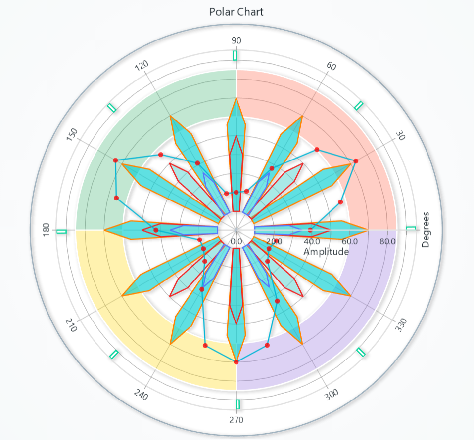
Polar Chart
Chart for visualizing data in a Polar coordinate system ( angle + amplitude ). It has various different types of series:
Creating Polar Chart
import lightningchart as lc

chart = lc.PolarChart(title='PolarChart', theme=lc.Themes.Light)
Chart Title
Control title, text, style, position, and visibility of the chart.
# Set or update the chart title
chart.set_title("My Custom Title")

# Change title color
chart.set_title_color('#FF0000')

# Adjust title font (size, family, weight, style)
chart.set_title_font(size=18, family="Arial, sans-serif", weight="bold", style="italic")

# Set padding below the title
chart.set_title_margin(10)

# Rotate title by 45°
chart.set_title_rotation(45)

# Apply theme effect (e.g. drop shadow)
chart.set_title_effect(True)

# Hide title altogether
chart.hide_title()
Angle (Radial) Axis
Retrieve the angular axis for custom ticks, divisions, etc.:
radial_axis = chart.get_radial_axis()
# How many angular divisions (ticks) around the circle:
radial_axis.set_division(8)

# Read back the current division count:
current = radial_axis.get_division()

# Choose clockwise vs counter-clockwise rotation:
radial_axis.set_clockwise(True)

# Rotate which angle sits at “north”:
radial_axis.set_north(0)

# Replace all tick labels with your own list:
radial_axis.set_tick_labels(['N','NE','E','SE','S','SW','W','NW'])
Tick Label Styling
Control font, rotation, and padding of radial axis tick labels:
radial = chart.get_radial_axis()

# Compact labels with a bit of spacing
radial.style_tick_labels(size=10, weight='600', rotation=0, tick_padding=3, label_padding=2)
Space After Ticks
# Add extra margin after the radial axis ticks
chart.get_radial_axis().set_margin_after_ticks(4)
Amplitude Axis Tick Strategy
By default amplitude axes use a numeric tick strategy. You can override it on either axis:
# On the amplitude axis:
chart.get_amplitude_axis().set_tick_strategy(
    'DateTime', time_origin=0, utc=True
)
Tick Label Styling
Control font, rotation, and padding of amplitude tick labels.
amp = chart.get_amplitude_axis()

# Show 1 decimal place with a 'dB' suffix:  "12.3 dB"
amp.set_tick_format(decimals=1, suffix='dB')

# Plain integers, no suffix
amp.set_tick_format(decimals=0, suffix=None)
Chart Background
Customize chart background.
# Solid background color
chart.set_background_color('#D80A0A')

# Background border/stroke
chart.set_background_stroke(2, 'red')
Set padding
# To set padding around the chart in pixels
chart.set_padding(left=10, top=15, right=20, bottom=25)
Disable/Enable animations
# To disable or enable all animations of the Chart
chart.set_animations_enabled(True)
solve_nearest
Polar charts and every polar series (Line, Point, Point Line, Area, Polygon, Heatmap) inherit solve_nearest, letting you inspect the data point closest to a client coordinate or to the last pointer position.
# Chart-level solve_nearest in interpolated mode.
hits = chart.solve_nearest(client_x=420, client_y=300, solve_mode='show-nearest-interpolated')
for entry in hits:
    print(entry.get('series'), entry.get('angle'), entry.get('amplitude'))

# Series-level query.
result = series.solve_nearest(client_x=400, client_y=300)
for entry in result:
    print(entry.get('angle'), entry.get('amplitude'))

# Polar Heatmap example
heatmap_hits = heatmap.solve_nearest(client_x=420, client_y=300)
for entry in heatmap_hits:
    print(entry.get('sector'), entry.get('annulus'), entry.get('intensity'))
- Valid
solve_modevalues:'show-nearest','show-nearest-interpolated','show-pointed','show-pointed-interpolated','show-all','show-all-interpolated'. - When
client_xandclient_yare omitted the chart resolves the last mouse position, which is handy for hover tooltips. - Returned dictionaries always include the detected
seriesname, and depending on the series type includeangle/amplitude(polar series) orsector,annulus, andintensity(polar heatmap). Colors are reported as rgba strings when available, enabling synchronized highlights or annotations.
Add TextBox
Please see common TextBox section.
Cursors
Please see common Cursors section.
Legend
Please see common legend section.