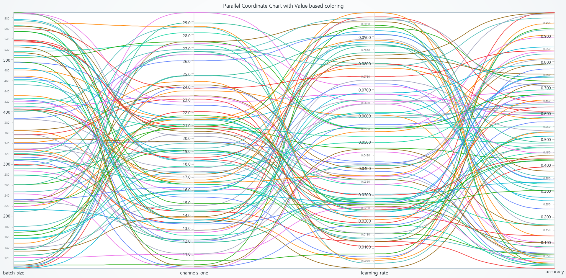
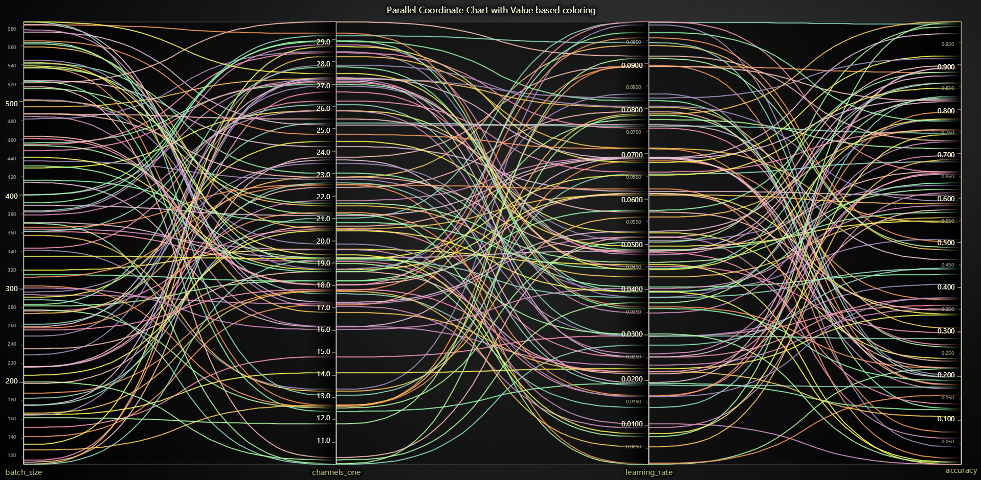
Parallel Coordinate Chart
The Parallel Coordinate Chart can be used to display a list of data points across an arbitrary number of measurement Axes. Each data point is displayed as a series of connected points along the axes which are positioned parallel to each other.
Creating TreeMap Chart
import lightningchart as lc

chart = lc.ParallelCoordinateChart(theme=lc.Themes.Light, title="Parallel Coordinate Chart")
Appearance Customization
Customize the look and layout of your Parallel Coordinate Chart Chart using the following methods.
Title
chart.set_title_color('#3498db')
chart.set_title_font(size=20, weight='bold')
chart.set_title_margin(10)
chart.set_title_rotation(0)
chart.set_title_effect(True)
Padding
Adjusts the space around the chart's plot area.
chart.set_padding(10)  # Uniform padding
chart.set_padding(left=10, top=15)  # Specific sides
chart.set_padding(left=10, top=15, right=20, bottom=25)  # All sides
Background Color
Sets the background fill color of the chart.
chart.set_background_color("#ffffff")
Background Stroke
Defines the border (stroke) around the chart's background.
chart.set_background_stroke(2, "#cccccc")
Series Background
Customize the look behind the lines to improve contrast or add theme effects.
# Disable theme-defined background effects
chart.set_series_background_effect(False)

# Fill the chart's series area with a solid color
chart.set_series_background_color('#F5F5F5')
Axes Configuration
Define which dimisions appear, fetch a particular axis for per-axis settings, or add new ones.
# Specify the exact list of axes (by key) in display order
chart.set_axes(['Temperature', 'Pressure', 'Yield'])

# Retrieve a handle to the “Pressure” axis for further customization
pressure_axis = chart.get_axis('Pressure')
Series Management
Add and retrieve data series, and color them via a lookup table (LUT) or spline interpolation.
# Create a new empty data series
series = chart.add_series()

# List all existing series on the chart
all_series = chart.get_series()

# Color lines based on their “Yield” dimension using a LUT
chart.set_lut(
    axis_key='Yield',
    interpolate=True,
    steps=[
        {'value': 0.0,  'color': '#FF0000'},
        {'value': 50.0, 'color': '#FFFF00'},
        {'value':100.0, 'color': '#00FF00'},
    ]
)

# Color lines based on their “Variable B” dimension using a LUT with formatting
chart.set_lut(
    axis_key="Variable B",
    interpolate=True,
    steps=[
        {'value': 80, 'color': 'red'},
        {'value': 100, 'color': 'yellow'},
        {'value': 112, 'color': 'green'},
    ],
    formatter_operation='ceil',
    formatter_precision=2,
    formatter_scale=2,
    formatter_unit='%',
    formatter_type='compact'
)

# Disable smooth spline curves and apply straight polylines
chart.set_spline(False)

# Thicken each series line for better visibility
chart.set_series_stroke_thickness(3)

# Highlight only the hovered line
chart.set_highlight_on_hover(True)

# Darken unselected series by coloring them light gray
chart.set_unselected_series_color('#CCCCCC')
User Interactions
Fine-tune how users can pan, zoom, select ranges, and hover across the axes.
# Disable all built-in interactions
chart.set_user_interactions(None)

# Restore defaults
chart.set_user_interactions({})

# Disable creating range selectors only by double-click
chart.set_user_interactions({
    'rangeSelectors': {
        'create':   {'doubleClickAxis': False},
        'dispose':  {'doubleClick':   False},
    },
})
Axis-Specific Controls
Once you have an axis handle, you can add range selectors, change visibility or title, and style ticks.
pressure_axis = chart.get_axis('Pressure')

# Add a draggable range selector to “Yield” axis
selector = pressure_axis.add_range_selector()

# Set its visible interval from 20 to 80
selector.set_interval(20, 80)

# Hide the selector when done
selector.dispose()

# Change the axis title
pressure_axis.set_title("Pressure (bar)")

# Show or hide the axis
pressure_axis.set_visible(True)

# Get current title text
current_title = pressure_axis.get_title()

# Apply a color palette to the axis stroke
pressure_axis.set_palette_stroke(
    thickness=2,
    interpolate=True,
    steps=[
        {'value':0,   'color':'#00A0FF'},
        {'value':1,   'color':'#FF0044'},
    ]
)

# Or use a solid stroke color
pressure_axis.set_solid_stroke(2, '#333333')

# Change how tick labels are formatted (numeric, datetime, etc.)
pressure_axis.set_tick_strategy('Numeric')

# Freeze the axis to prevent automatic scrolling
pressure_axis.set_stopped(True)
pressure_axis.set_stopped(False)  # Let the strategy move it again

# Display units in the axis title
pressure_axis.set_units('bar', { 'displayOnAxis': True})

# Enable/Disable smooth animated scrolling
pressure_axis.set_animation_scroll(True)
pressure_axis.set_animation_scroll(False)  # Instant jump
Coordinate Transformation
Convert between screen and chart-relative coordinates for positioning and interaction handling.
# Client to relative (auto-detect)
relative = chart.translate_coordinate(
    {'clientX': 500, 'clientY': 300},
    target='relative'
)

# Relative to client
client = chart.translate_coordinate(
    {'x': 400, 'y': 250},
    target='client',
    source='relative'
)
- relative: Pixels from chart edges
- client: Browser viewport pixels
Styling Tick Labels
You can comprehensively style tick labels on individual axes or all axes at once with font, color, rotation, and formatting options.
Style Individual Axis
# Get an axis
temperature_axis = chart.get_axis('Temperature')

# Basic font styling
temperature_axis.set_tick_labels(
    major_size=14,
    minor_size=10,
    family='Arial',
    weight='bold',
    style='normal'
)

# Format with units and precision
temperature_axis.set_tick_labels(
    major_size=12,
    precision=1,        # 1 decimal place
    unit='°C',          # Append unit
    scale=1.0           # Scale factor (e.g., 1000 for k conversion)
)
Available format types:
'standard'- Normal number formatting (default)'currency'- Currency formatting with symbol ($)'percentage'- Percentage formatting (value × 100 + %)'compact'- Compact notation (1.2K, 5.3M, 2.1B, 7.8T)'engineering'- Engineering notation with powers of 1000'scientific'- Scientific notation (exponential)'integer'- Rounded integer values
Style All Axes at Once
Instead of styling each axis individually, you can apply consistent styling to all axes:
# Style all axes with the same settings
chart.set_all_axes_tick_labels(
    major_size=14,
    minor_size=10,
    weight='bold',
    major_color=('darkblue'),
    precision=2
)

# Rotate all axis labels
chart.set_all_axes_tick_labels(
    major_size=12,
    major_rotation=18,  # Useful for long labels
    family='Arial'
)

# Apply uniform formatting to all axes
chart.set_all_axes_tick_labels(
    major_size=12,
    format_type='standard',
    precision=1
)

# You can still override individual axes after applying global styling
chart.set_all_axes_tick_labels(major_size=12, weight='normal')
chart.get_axis('Critical_Axis').set_tick_labels(
    major_size=16,
    major_color=('red'),
    weight='bold'
)
Custom Ticks (labels you control)
You can add fully customized ticks to any axis to set their value, label text, font, color, tick line style/length, alignment, visibility, and remove them.
# Get an axis handle (e.g., Pressure)
pressure_axis = chart.get_axis('Pressure')

# Add a custom tick to this axis
tick = pressure_axis.add_custom_tick()

# Position it at value 42 (in axis units)
tick.set_value(42)

# Show custom text instead of the default formatted number
tick.set_text("Valve A")

# Style the label text
tick.set_text_fill_style('#0055CC')               # color (use None or 'transparent' to hide)
tick.set_text_font(size=14, family='Segoe UI', weight='bold', style='normal')

# Adjust label layout by pixels between tick line and text and also rotate it in degree
tick.set_text_padding(6)
tick.set_text_rotation(0)

# Style the tick line itself
tick.set_tick_length(12)                           # pixel length of the little tick line
tick.set_tick_style(thickness=2, color='#0055CC')

# Control label alignment relative to the tick line
# -1 = after, 0 = centered, +1 = before (relative to axis direction)
tick.set_label_alignment(-1)

# Toggle visibility
tick.set_visible(True)

# Remove the custom tick when no longer needed
tick.dispose()
Disable/Enable animations
# To disable or enable all animations of the Chart
pressure_axis.set_animations_enabled(False)
Add TextBox
Please see common TextBox section.
Cursors
Please see common Cursors section.
Legend
Please see common legend section.
User Interactions
Please see common User Interactions section.