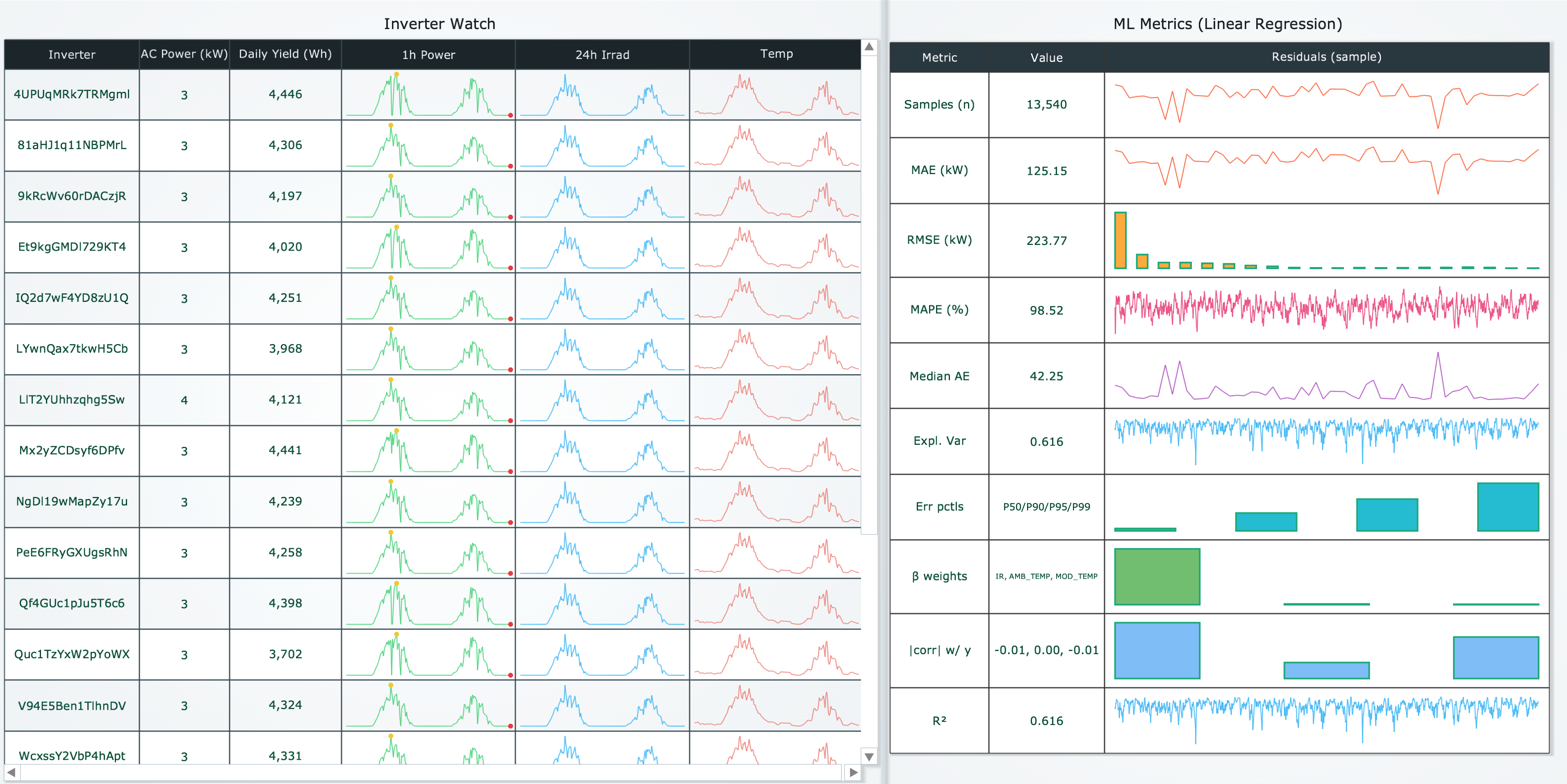
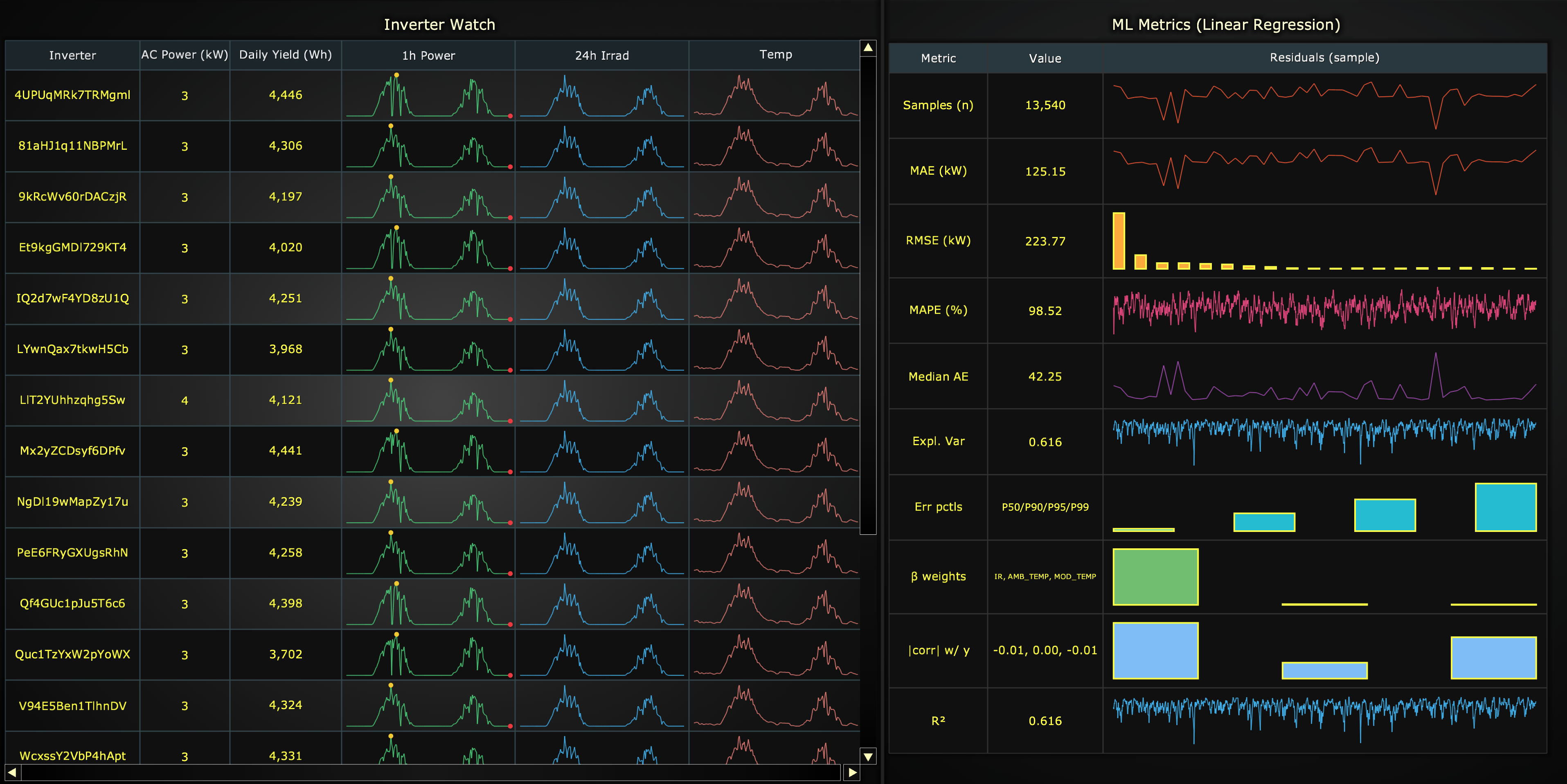
Data Grid
Data Grid is a feature that displays content as a flexible grid, with rows and columns and each cell having its own content. Data grid supports a variety of cell content types such as text, numbers, colors, icons and spark charts.
Creating a DataGrid
import lightningchart as lc

grid = lc.DataGrid(
    theme=lc.Themes.Light,
    theme_scale=1.0,
    title='Orders',
    html_text_rendering=True,
)
Appearance Customization
Customize the look and layout of your grid using the following methods.
Title
grid.set_title_color('#3498db')
grid.set_title_font(size=20, weight='bold')
grid.set_title_margin(10)
grid.set_title_rotation(0)
grid.set_title_effect(True)
Padding
Adjusts the space around the grid's plot area.
grid.set_padding(10)  # Uniform padding
grid.set_padding(left=10, top=15)  # Specific sides
grid.set_padding(left=10, top=15, right=20, bottom=25)  # All sides
Background Color
Sets the background fill color of the grid.
grid.set_background_color("#ffffff")
Background Stroke
Defines the border (stroke) around the grid's background.
grid.set_background_stroke(2, "#cccccc")
Basic table
grid.set_table_content([
    ['Product', 'Qty', 'City'],
    ['Keyboard', 120, 'Helsinki'],
    ['Mouse', 200, 'Tampere'],
])
Spark Charts in Cells
DataGrid supports compact, in-cell trend visuals ("sparklines"), ideal for scanning patterns at a glance.
Supported spark types
1. spark-line
Line series with optional markers for highlighting key data points.
Properties:
type:'spark-line'data: Array of numbers or{x, y}objectsstrokeStyle: Line style- Simple:
'#1e88e5'or'blue' - Detailed:
{'thickness': 2, 'color': '#1e88e5ff'}
- Simple:
markers: Array of marker objects - see Markers section
grid.set_cell_content(1, 2, {
    'type': 'spark-line',
    'data': [10, 12, 9, 15, 13, 18],
    'strokeStyle': {'thickness': 2, 'color': '#1e88e5ff'},
    'markers': [
        {'type': 'point', 'value': 'max', 'fillStyle': 'red', 'size': 8}
    ]
})
2. spark-area
Filled area series with optional markers.
Properties:
type:'spark-area'data: Array of numbers or{x, y}objectsfillStyle: Fill colorstrokeStyle: Border line stylemarkers: Array of marker objects - see Markers section
grid.set_cell_content(2, 2, {
    'type': 'spark-area',
    'data': [5, 8, 6, 10, 9],
    'fillStyle': '#43a04733',
    'strokeStyle': {'thickness': 1, 'color': '#43a047ff'}
})
3. spark-bar
Vertical bar chart for comparing discrete values.
Properties:
type:'spark-bar'data: Array of numbersfillStyle: Bar fill colorstrokeStyle: Bar border stylebarSize: Bar width multiplier, range [0, 1]gap: Gap between bars in pixels
grid.set_cell_content(3, 2, {
    'type': 'spark-bar',
    'data': [5, 9, 7, 11],
    'fillStyle': '#43a047ff',
    'barSize': 0.8,
    'gap': 2
})
4. spark-win-loss
Binary outcome visualization with win/loss bars relative to a threshold.
Properties:
type:'spark-win-loss'data: Array of numberswinFillStyle: Fill color for positive valueslossFillStyle: Fill color for negative valuesstrokeStyle: Bar border stylethreshold: Reference value separating wins from lossesbarSize: Bar width multiplier, range [0, 1]gap: Gap between bars in pixels
grid.set_cell_content(4, 2, {
    'type': 'spark-win-loss',
    'data': [1, -1, 1, 1, -1, 1],
    'winFillStyle': '#2e7d32',
    'lossFillStyle': '#c62828',
    'threshold': 0,
    'gap': 1
})
5. spark-pie
Categorical proportions as a compact pie chart.
Properties:
type:'spark-pie'data: Array of numbers representing slice valuesstrokeStyle: Border between slices
grid.set_cell_content(5, 2, {
    'type': 'spark-pie',
    'data': [30, 45, 25],
    'strokeStyle': {'thickness': 1, 'color': 'white'}
})
Markers
Markers are available for spark-line and spark-area charts. Three marker types are supported:
Point Marker
Highlights a single XY coordinate with a visual marker.
Properties:
type:'point'value: Location'start': First data point'end': Last data point'min': Lowest Y value'max': Highest Y value{'x': 5, 'y': 10}: Exact coordinate
fillStyle: Marker fill colorsize: Marker size in pixelsshape: Marker shaperotation: Rotation in degrees
grid.set_cell_content(1, 3, {
    'type': 'spark-line',
    'data': [0, 10, 6, 4, 9, 8, 3, 6],
    'markers': [
        {'type': 'point', 'value': 'max', 'fillStyle': 'green', 'size': 10},
        {'type': 'point', 'value': 'min', 'fillStyle': 'red', 'size': 8}
    ]
})
Axis Band
Highlights an interval along the X or Y axis.
Properties:
type:'axis-band'axis:'x'or'y'start: Start position on axisend: End position on axisfillStyle: Band fill colorstrokeStyle: Band border style
grid.set_cell_content(2, 3, {
    'type': 'spark-area',
    'data': [45, 60, 75, 80, 70],
    'markers': [
        {'type': 'axis-band', 'axis': 'y', 'start': 70, 'end': 100,
         'fillStyle': '#ff000033'}
    ]
})
Constant Line
Highlights a specific value along the X or Y axis (e.g., threshold or target).
Properties:
type:'constant-line'axis:'x'or'y'value: Position on axisstrokeStyle: Line style
grid.set_cell_content(3, 3, {
    'type': 'spark-line',
    'data': [85, 92, 88, 95, 90],
    'markers': [
        {'type': 'constant-line', 'axis': 'y', 'value': 90,
         'strokeStyle': {'thickness': 2, 'color': 'orange'}}
    ]
})
Images in Cells
Add images to cells for logos, icons, or visual indicators.
# From local file
grid.set_cell_image_content(
    column=1,
    row=1,
    source='D:/images/logo.png',
    height=32
)

# From URL
grid.set_cell_image_content(
    column=2,
    row=1,
    source='https://example.com/icon.png',
    height=32,
    width=48
)

# Spanning multiple cells
grid.set_cell_image_content(
    column=0,
    row=2,
    source='banner.jpg',
    colspan=3,
    rowspan=1,
    height=60
)
Setting Content
Single cell
grid.set_cell_content(0, 0, 'Header')
grid.set_cell_content(1, 2, 42)
Whole row
grid.set_row_content(2, ['Headset', 320, 'Oulu', {'type': 'spark-pie', 'data': [30, 70]}, 'Good'])
Whole column
grid.set_column_content(3, [
    'Trend',
    {'type': 'spark-line', 'data': [10, 15, 12, 18], 'strokeStyle': '#e53935ff'},
    {'type': 'spark-bar',  'data': [5, 10, 8, 12],  'fillStyle': '#43a047ff'},
    {'type': 'spark-win-loss', 'data': [1, -1, 1, 1]},
])
Styling Cells
Background and text color
grid.set_cell_background_fill_style(0, 0, '#f5f5f5ff')  # header cell bg
grid.set_cell_text_fill_style(0, 0, '#212121ff')        # header text
Font
# Single cell
grid.set_cell_text_font(0, 0, size=15, family='Arial', weight='bold')

# Defaults for all cells
grid.set_cells_text_font(size=13, family='Inter', weight='500', style='normal', variant=True)
Padding
# Single cell
grid.set_cell_padding(1, 1, 8)
grid.set_cell_padding(2, 1, {'left': 8, 'right': 8})

# Defaults for all cells
grid.set_cells_padding({'top': 6, 'bottom': 6, 'left': 10, 'right': 10})
Borders
# Global visibility + stroke
grid.set_cells_borders(True)
grid.set_cells_border_stroke_style(thickness=1, color='#e0e0e0ff')

# Per cell / row / column
grid.set_cell_borders(1, 1, {'left': True, 'right': False})
grid.set_row_borders(0, {'bottom': True})
grid.set_column_borders(2, {'left': True})
Alignment
Set how content is positioned within cells:
# Defaults for all cells
grid.set_cells_content_alignment('center')

# Per column / row / cell
grid.set_column_content_alignment(2, 'right-center')
grid.set_row_content_alignment(1, 'left-center')
grid.set_cell_content_alignment(3, 2, 'center-bottom')
Sizing
# Column width: fixed px, constraints, or None (fit-to-content)
grid.set_column_width(0, 160)
grid.set_column_width(1, {'min': 80, 'max': 200})
grid.set_column_width(2, None)

# Row height: fixed px, constraints, or None (fit-to-content)
grid.set_row_height(0, 28)
grid.set_row_height(2, {'min': 24, 'max': 44})
grid.set_row_height(3, None)
Row / Column styling
# Backgrounds
grid.set_row_background_fill_style(0, '#E3F2FD')
grid.set_column_background_fill_style(2, '#FAFAFA')

# Text color + font
grid.set_row_text_fill_style(1, '#424242')
grid.set_row_text_font(1, size=13, weight='600')
grid.set_column_text_fill_style(2, '#1B5E20')
grid.set_column_text_font(2, size=13, style='italic')
Highlights
# Subtle emphasis through theme-based brightening/darkening
grid.set_cell_highlight(1, 1, True)     # on/off
grid.set_row_highlight(2, 0.35)         # custom intensity [0..1]
grid.set_column_highlight(3, 0.5)
Grid Background
grid.set_grid_background_fill_style('#FFFFFF')  # or 'transparent' / None to hide
grid.set_background_effect(True)                # theme background effect
Coordinate Translation
Translate between client and relative coordinates:
# Client -> relative
pos = grid.translate_coordinate({'clientX': 500, 'clientY': 300}, target='relative')

# Relative -> client
pos2 = grid.translate_coordinate({'x': 50, 'y': 100}, target='client')
Editing / Removing
grid.remove_cell(1, 1)
grid.remove_column(2)
grid.remove_row(3)
grid.remove_cells()  # remove all
Add TextBox
Please see common TextBox section.