Map Chart
Chart for visualizing a geographical map of a selected part of the world.
View
A Map Chart displays a specific view of the world. The currently available options are:
- World
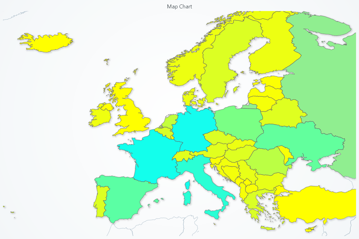
- Europe
- Africa
- Asia
- Australia
- NorthAmerica
- SouthAmerica
- USA
- Canada
import lightningchart as lc
chart = lc.MapChart(map_type='World')
Appearance Customization
Customize the look and layout of your Chart using the following methods.
Title
chart.set_title_color('#3498db')
chart.set_title_font(size=20, weight='bold')
chart.set_title_margin(10)
chart.set_title_rotation(0)
chart.set_title_effect(True)
Padding
Adjusts the space around the chart's plot area.
chart.set_padding(10)  # Uniform padding
chart.set_padding(left=10, top=15)  # Specific sides
chart.set_padding(left=10, top=15, right=20, bottom=25)  # All sides
Background Color
Sets the background fill color of the chart.
chart.set_background_color("#ffffff")
Background Stroke
Defines the border (stroke) around the chart's background.
chart.set_background_stroke(2, "#cccccc")
Palette & Fill Styling
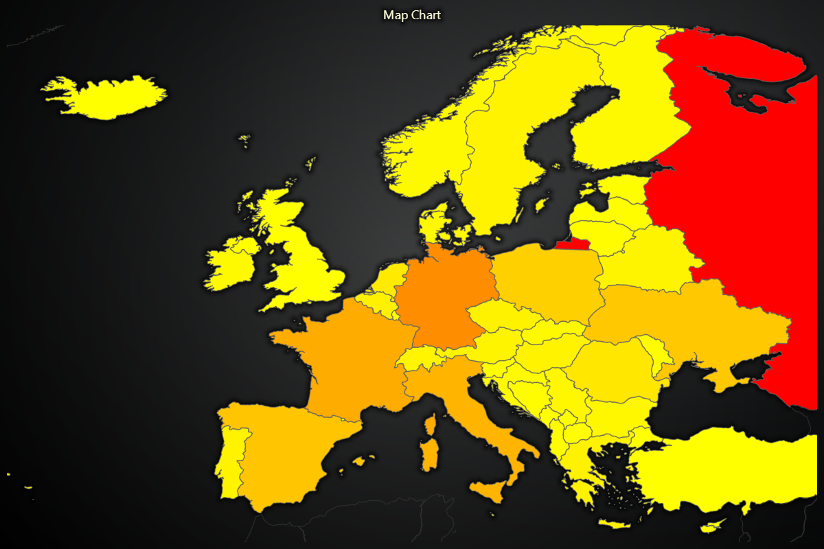
Define a dynamic color lookup table (LUT) so that each region is filled based on its value, with optional interpolation.
# Dynamically color regions based on their numeric values:
chart.set_palette_coloring(
    steps=[
        {'value': 0, 'color': '#FF0000', 'label': 'Min'},
        {'value': 50, 'color': '#00FF00'},
        {'value':100, 'color': '#0000FF', 'label': 'Max'},
    ],
    look_up_property='value',
    percentage_values=True
)

# With formatted legend display:
chart.set_palette_coloring(
    steps=[
        {'value': 0, 'color': '#0000FF'},
        {'value': 100, 'color': '#FF0000'},
    ],
    look_up_property='value',
    formatter_precision=2,           # Decimal places
    formatter_unit='mag',             # Unit suffix
    formatter_scale=1.5,              # Scale values
    formatter_type='scientific',      # 'standard', 'compact', 'engineering', 'scientific'
    formatter_operation='floor',      # 'none', 'round', 'ceil', 'floor'
)
Fill all regions with a single, solid color.
# Color every region light gray:
chart.set_color('#D3D3D3')
Remove any fill, leaving regions transparent (no coloring).
# Make all regions transparent:
chart.set_empty_color_fill()
Data Binding & Updates
Supply or update numeric values for each map region.
# Update Finland and Sweden values:
chart.invalidate_region_values([
    {'ISO_A3':'FIN', 'value': 1},
    {'ISO_A3':'SWE', 'value': 2},
])
Interaction & Highlighting
Toggle whether regions highlight on mouse hover, improving interactivity.
# Enable region highlighting on hover:
chart.set_highlight_on_hover(True)
Outlier & Separate Regions
Color “outlier” regions (visible but not part of the active map type) with a distinct fill.
# Color outlier regions light pink:
chart.set_outlier_region_color('#FFC0CB')
Adjust the border stroke for outlier regions.
# Thin dark border around outliers:
chart.set_outlier_region_stroke(1, '#800000')
Fill “separate” regions (like Alaska or Hawaii in USA view) with a custom color.
# Color separate regions pale yellow:
chart.set_separate_region_color('#FFFFE0')
Customize the stroke around separate regions for clearer separation.
# Bold blue border around separate regions:
chart.set_separate_region_stroke(2, '#0000CD')
Global Stroke
Set the border stroke style for all regions on the map in one call.
# Uniform thin gray borders for every region:
chart.set_stroke(0.5, '#A9A9A9')
Real-time data
For animated or real-time use cases, data displayed by Map Chart can be easily updated during run-time as fast as needed by simply calling invalidate_region_values method again.
Disable/Enable animations
# To disable or enable all animations of the Chart
chart.set_animations_enabled(False)
Coordinate Transformation
Please refer to Coordinate Transformation section.
Add TextBox
Please see common TextBox section.
Cursors
Please see common Cursors section.
Legend
Please see common legend section.