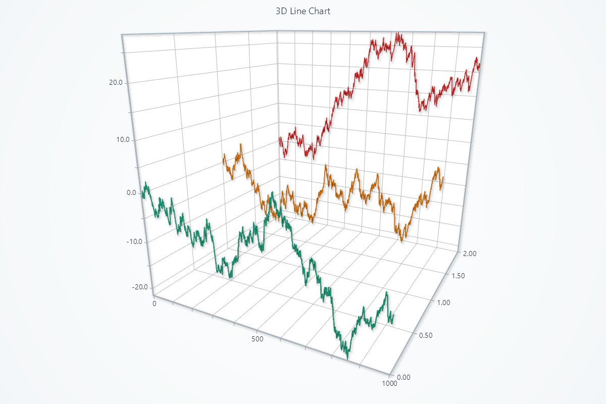
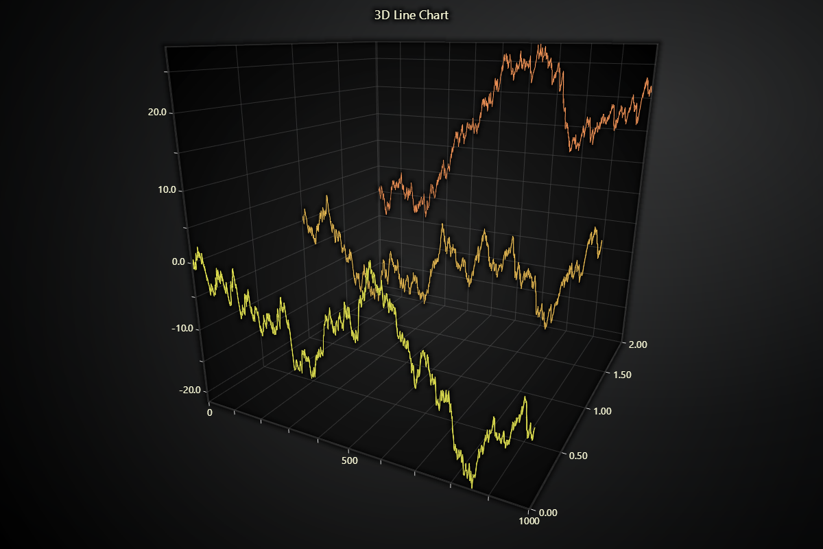
3D Lines
Chart3D has two series types for visualizing 3D lines:
Line Series
Series type for visualizing a collection of x-y-z coordinates by a continuous line stroke, optimized for massive amounts of data.
Creating Line Series
series = chart.add_line_series(
    automatic_color_index=0,
    individual_lookup_values_enabled=True,
)
automatic_color_indexOptional index to use for automatic coloring of series.individual_lookup_values_enabledFlag that can be used to enable data points value property on top of x, y and z. By default this is disabled.
Adding Data
You can append points one at a time (or in bulk) via dictionaries, or pass three coordinate arrays.
# 1) Using a list of dicts, each with x/y/z:
data_points = [
    {'x': 0, 'y': 0, 'z': 0},
    {'x': 1, 'y': 2, 'z': 3},
    {'x': 2, 'y': 3, 'z': 5},
]
series.add_dict_data(data_points)

# 2) Using three parallel lists:
x_vals = [0, 1, 2]
y_vals = [0, 2, 3]
z_vals = [0, 3, 5]
series.add(x_vals, y_vals, z_vals)

# 3) Or pass a single list of dicts via .add():
series.add(data_points)
Line Appearance
Control stroke color, thickness, and even set up per-value palettes.
# Solid color:
series.set_line_color('#ff0000')
series.set_line_thickness(2)

# Dynamic color palette based on x/y/z/value:
series.set_palette_line_coloring(
    steps=[
        {'value': 2, 'color': '#FF0000', 'label': 'Min'},
        {'value': 4, 'color': (255, 255, 0)},
        {'value': 7, 'color': 'green', 'label': 'Max'},
    ],
    look_up_property='y',
    interpolate=True,
)

# With formatted legend display:
series.set_palette_line_coloring(
    steps=[
        {'value': 0, 'color': '#0000FF'},
        {'value': 100, 'color': '#FF0000'},
    ],
    look_up_property='value',
    formatter_precision=2,           # Decimal places
    formatter_unit='mag',             # Unit suffix
    formatter_scale=1.5,              # Scale values
    formatter_type='scientific',      # 'standard', 'compact', 'engineering', 'scientific'
    formatter_operation='floor',      # 'none', 'round', 'ceil', 'floor'
)
Depth Testing
By default, WebGL depth testing is enabled. This means that any other 3D data that is drawn after a series AND is behind that series in the chart will not be rendered on the screen to save GPU processing. Normally, this is no concern. However, when visualizing transparent 3D objects this may result in unexpected visual results (objects missing from scene). Depth testing can be disabled with set_depth_test_enabled.
# Disable depth test so lines behind will still render:
series.set_depth_test_enabled(False)
3D Color Shading
By default, 3D series are using shaded 3D color graphics. This means that the color of surfaces vary on perceived angle, giving a sense of depth and surface shape. This can be disabled to color every part of a series with a solid color, similar to 2D graphics:
# Enable Phong shading with a specular highlight:
series.set_color_shading_style(
    phong_shading=True,
    specular_reflection=0.7,
    specular_color='#ffffff'
)
Series Utility Methods
# Set a name for the series (used in legend and tooltip)
series.set_name("Team Alpha")

# Highlight the series fully (1.0 = max highlight)
series.set_highlight(1.0)

# Enable or disable whether this series participates in cursor pick events
series.set_cursor_enabled(False)

# Enable or disable theme-based visual effects
series.set_effect(True)

# Toggle series visibility (False hides it from view)
series.set_visible(True)

# Clear all points from the series
series.clear()

# Permanently remove the series from the chart
series.dispose()
Data cleaning / maximum memory use
3D line series does not have built-in functionality for automatic data cleaning.
Point Line Series
Series type for visualizing a collection of x-y-z coordinates by a continuous line stroke and markers. 3D point line series is almost exactly the same feature as 3D line series. For point-specific configurations and guides, keep reading, otherwise please refer to 3D Line.
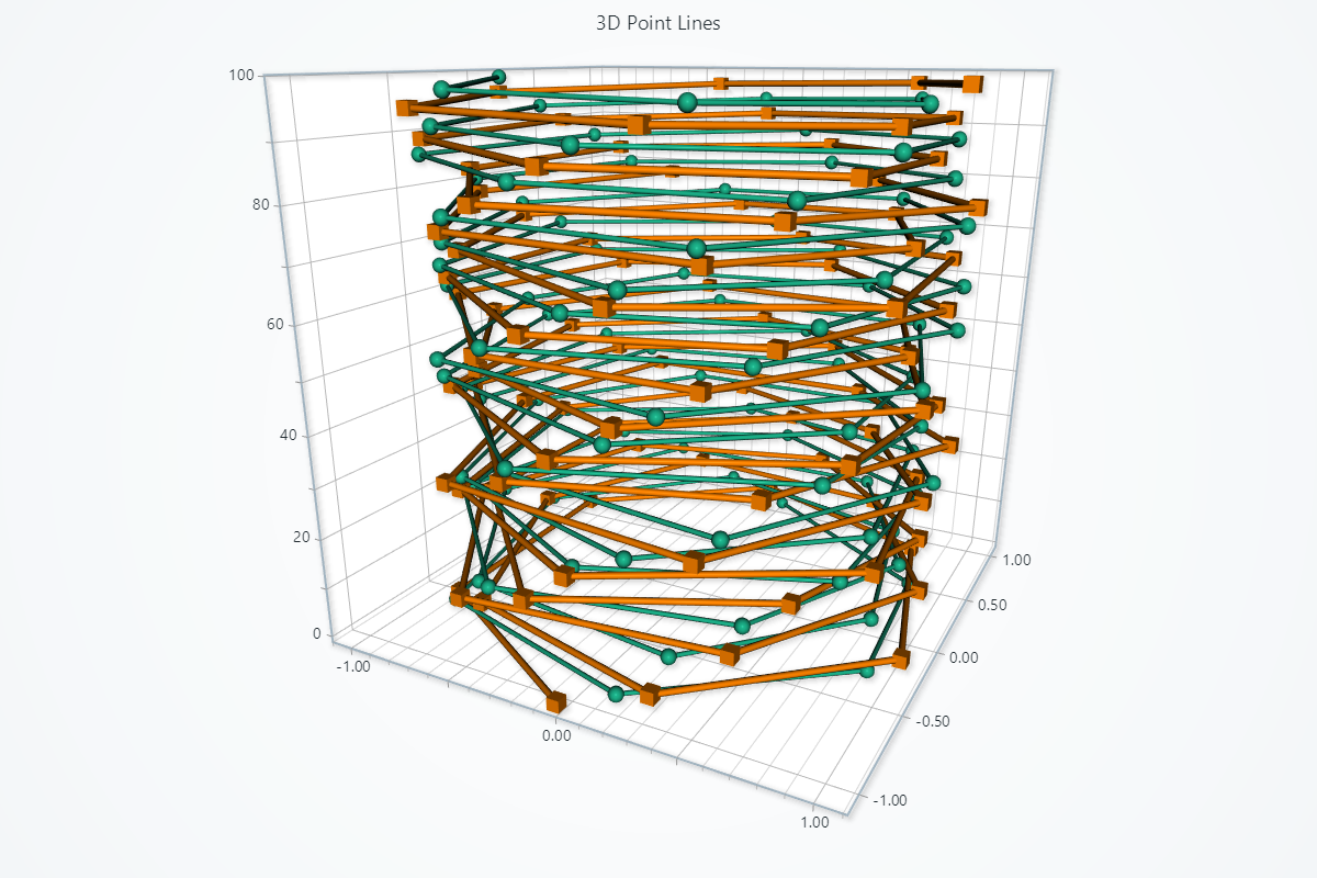
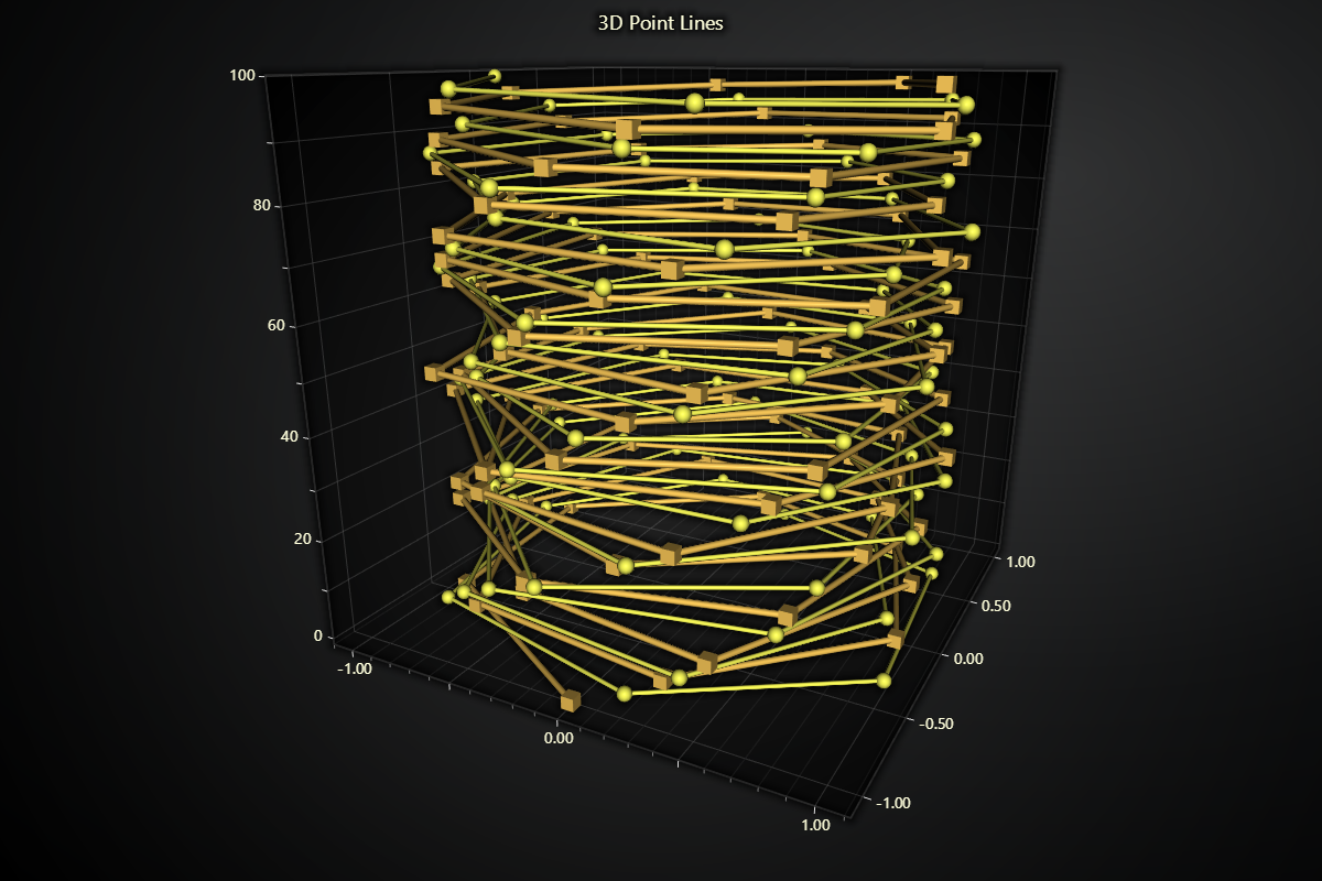
Creating Point Line Series
series = chart.add_point_line_series()
Point Appearance
Control the look of each marker on your 3D point-line series.
# Change the shape of all points:
series.set_point_shape('triangle')
#   Options: "arrow", "circle", "cross", "diamond",
#            "minus", "plus", "square", "star", "triangle"

# Set a uniform fill color for every point:
series.set_point_color('#FF8800')

# Adjust the pixel size of each point:
series.set_point_size(6)

# Define a palette for dynamically looked up fill coloring for the points:
series.set_palette_point_colors(
    steps=[
        {'value': 10, 'color': '#FF0000', 'label': 'Min'},
        {'value': 50, 'color': '#00FF00'},
        {'value': 100, 'color': '#0000FF', 'label': 'Max'},
    ],
    look_up_property='y',
)

# With formatted legend display:
series.set_palette_point_colors(
    steps=[
        {'value': 0, 'color': '#0000FF'},
        {'value': 100, 'color': '#FF0000'},
    ],
    look_up_property='value',
    formatter_precision=2,           # Decimal places
    formatter_unit='mag',             # Unit suffix
    formatter_scale=1.5,              # Scale values
    formatter_type='scientific',      # 'standard', 'compact', 'engineering', 'scientific'
    formatter_operation='floor',      # 'none', 'round', 'ceil', 'floor'
)
Series Utility Methods
This section works the same as for Line, to avoid duplication of guides, please refer to the section under Line
Legend
Please see common legend section.