Axis
Axis defines a numeric range on a single plane (X or Y), that will be used to scale attached Series to the ChartXY's viewport.
Accessing Default Axes
Take references to the built-in axes for interval or styling changes.
x_axis = chart.get_default_x_axis()
y_axis = chart.get_default_y_axis()

# Example: lock the Y axis interval
y_axis.set_interval_restrictions(start_min=0, end_max=100)
Accessing axes from a Series
When you already have a series, you can read the axes it is attached to:
series = chart.add_line_series()
x_axis = series.axis_x
y_axis = series.axis_y

# Example: lock Y on the series' axis
series.axis_y.set_interval_restrictions(start_min=0, end_max=100)
Title & Appearance
Customize the appearance and style of the Axis title.
# Set axis title
axis.set_title("Time (ms)")

# Set axis title position
axis.set_title_position("start")

# Available positions
# "center", "end", "start", "center-chart"

# Set title color
axis.set_title_color('red')

# Set font for title
axis.set_title_font(
    size=16,
    family='Arial, Helvetica, sans-serif',
    style='italic',
    weight='bold'
)

# Set rotation
axis.set_title_rotation(90)

# Set title padding (around the title)
axis.set_title_margin(10)

# Set gap after title (between title and next axis)
axis.set_margin_after_title(10)

# Enable/Disable title effect
axis.set_title_effect(True)
Axis Visibility
# Show or hide the axis
axis.set_visible(True)

# Set style of axis overlay
axis.set_overlay_style((255, 255, 0))
Axis Stroke & Thickness
# Set stroke thickness and color
axis.set_stroke(thickness=2, color='black')

# Set axis thickness (in pixels)
axis.set_thickness(5)
Tick Configuration
Tick Formatting
# Custom text formatting
axis.set_tick_formatting("Value: {value}")
Custom Tick Elements
You can add fully custom ticks, then style and position them:
# Create a box-type tick on the X axis
custom = x_axis.add_custom_tick("box")

# Position it at x=2.5 (in axis data units)
custom.set_value(2.5)

# Override its label text and formatting
custom.set_text("Midpoint")
custom.set_decimal_precision(1)

# Control whether it reserves axis space
custom.set_allocates_axis_space(False)

# Style its grid line
custom.set_grid_stroke_length(50)
custom.set_grid_stroke_style(1, "gray")

# Style its marker (label) appearance
custom.set_marker_color("black")
custom.set_marker_font(size=10, family="Verdana", style="normal", weight="bold")
custom.set_marker_visible(True)

# Adjust padding and rotation of the label
custom.set_tick_label_padding(4)
custom.set_tick_label_rotation(45)

# And finally control its tick line length
custom.set_tick_length(8)
Fallback to Extreme Ticks
When the axis becomes too small for all labels, you can enable or disable showing the first/last tick:
# Enable automatic showing of extreme (first & last) tick labels
x_axis.set_fallback_to_extreme_ticks(True)

# Or restore default behavior (hides extremes when crowded)
x_axis.set_fallback_to_extreme_ticks(False)
Keep Tick Labels in Axis Bounds
Configure whether axis should keep tick labels within its boundaries:
# Keep tick labels within axis bounds (prevents overflow)
axis.set_keep_tick_labels_in_axis_bounds(True)

# Allow tick labels to overflow axis bounds
axis.set_keep_tick_labels_in_axis_bounds(False)
Great Tick Style (DateTime axes)
# Style for Great Ticks for a DateTime axis
axis.set_tick_strategy("DateTime")
axis.set_great_tick_style(
    color='green',
    size=14,
    length=10,
    family='Verdana',
    style='italic',
    weight='bold'
)

# Disable great ticks
axis.set_great_tick_style(disable=True)
Tick Labels
Control tick label styling and formatting, including font, color, rotation, scaling, units, rounding, and numeric formats (percentage, currency, scientific, etc.).
# Basic visual styling (font, color, rotation)
x_axis.set_tick_labels(
    major_size=12,
    family="Arial",
    style="normal",
    weight="bold",
    major_rotation=45,
    major_color=(255, 0, 0, 255),
)

# Numeric formatting example:
# - scale raw values by 0.001
# - round to 2 decimals
# - show as kHz
x_axis.set_tick_labels(
    format_type="standard",
    operation="round",
    precision=2,
    unit="kHz",
    scale=0.001,
)

# Set axis units (displayed after title and in cursor)
axis.set_units("Hz")

# Set units with display options
axis.set_units("°C", display_on_axis=True, display_in_cursor=True)

# Clear units
axis.set_units(None)
Axis intervals
Axis intervals can be configured by axis.set_interval()
import lightningchart as lc

lc.set_license('my-license-key')

chart = lc.ChartXY()
x_axis = chart.get_default_x_axis()
y_axis = chart.get_default_y_axis()

x_axis.set_interval(start=0, end=1000)
y_axis.set_interval(start=-250, end=500)
Default interval
Custom default axis interval can be set by axis.set_default_interval()
import lightningchart as lc

lc.set_license('my-license-key')

chart = lc.ChartXY()
x_axis = chart.get_default_x_axis()

x_axis.set_default_interval(start=-100, end=100)
Interval restrictions
Various axis interval restrictions can be applied by axis.set_interval_restrictions()
import lightningchart as lc

lc.set_license('my-license-key')

chart = lc.ChartXY()

x_axis = chart.get_default_x_axis()
x_axis.set_interval_restrictions(
    interval_min=10,
    interval_max=100,
    start_min=-25,
    start_max=25,
    end_min=25,
    end_max=50
)
Axes Types
Fit axis
Fit the axis to all attached series.
#   animate: ms duration (or True/False for on/off)
#   stop_axis_after: whether fitting freezes further scrolling
x_axis.fit(animate=250, stop_axis_after=True)
Scrolling axis
One of the most important features of LightningChart Python is smooth real-time visualization, i.e., visualization of a data set that is continuously receiving new data points.
In real-time monitoring use cases, there is often a scrolling axis (often Time axis) whose interval is progressively moving forward along with the incoming data. To achieve this, a scrolling strategy is used as default:
axis.set_scroll_strategy(
    strategy='scrolling',
    progressive=True,
    realtime=True,
    start=True,
    end=True,
    visibleonly=False
)
The scrolling strategy does not change size of axis interval, but shifts the interval forward when new data comes in.
To use it, the set_interval() method is used in conjunction to configure the axis interval
(important: remember to use stop_axis_after flag to prevent stopping the axis).
Logarithmic axes & multiple axes
ChartXY does not have a limit on number of axes. Additional axes can be created with chart.add_x_axis() and
chart.add_y_axis(). Multiple Axes can be stacked on top of another, and axes can be positioned on either side
of the chart (left, right, top, bottom)
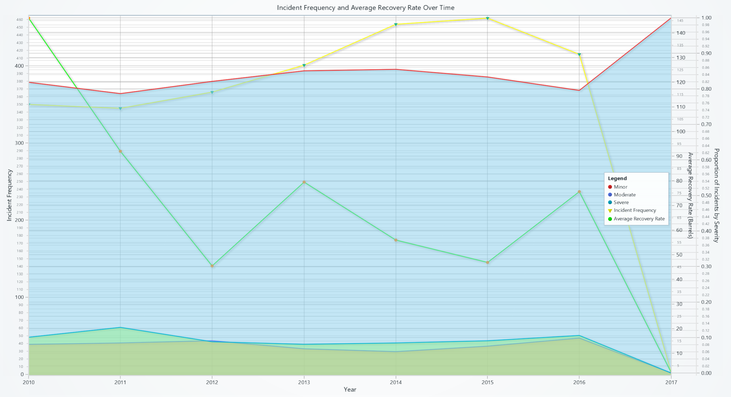

Date-Time axis
Display seconds, minutes, hours, days, months and years using automatically placed axis ticks.
axis.set_tick_strategy('DateTime')
For more information please see Time series data section.
Layout Configuration
# Set axis length (in pixels)
axis.set_length(length=0.5, relative=True)

# Add margins at start and end (in pixels)
axis.set_margins(start=10, end=20)

# Control scroll margin behavior
axis.set_scroll_margins(start=5, end=10)   # Asymmetric margins
axis.set_scroll_margins(8)                # Symmetric
axis.set_scroll_margins(False)            # Disable
axis.set_scroll_margins(None)             # Clear
Synchronized axes
Axes within ChartXY can be synchronized by chart.synchronize_axis_intervals().
This ensures that their interval is always the same.
User Interactions
Please see common User Interactions section.