Heatmap
Heatmaps can be created using ChartXY and Heatmap Grid Series, which is meant for visualizing grid/matrix data with static columns and rows count.
Creating Heatmap
series = chart.add_heatmap_grid_series(columns=3, rows=3)
Configuring Heatmap Coordinates
These methods allow you to define the spatial positioning of heatmap samples.
Set Start Coordinate
# Set the start coordinate to (0, 0)
series.set_start(x=0, y=0)
Set End Coordinate
# Set the end coordinate to (100, 50)
series.set_end(x=100, y=50)
Set Step Between Samples
# Set the step between samples to 10 in X and 5 in Y
series.set_step(x=10, y=5)
Data Input and Intensity Invalidation
Invalidate Intensity Values
Update heatmap intensity values using either 2D matrix or flat array format:
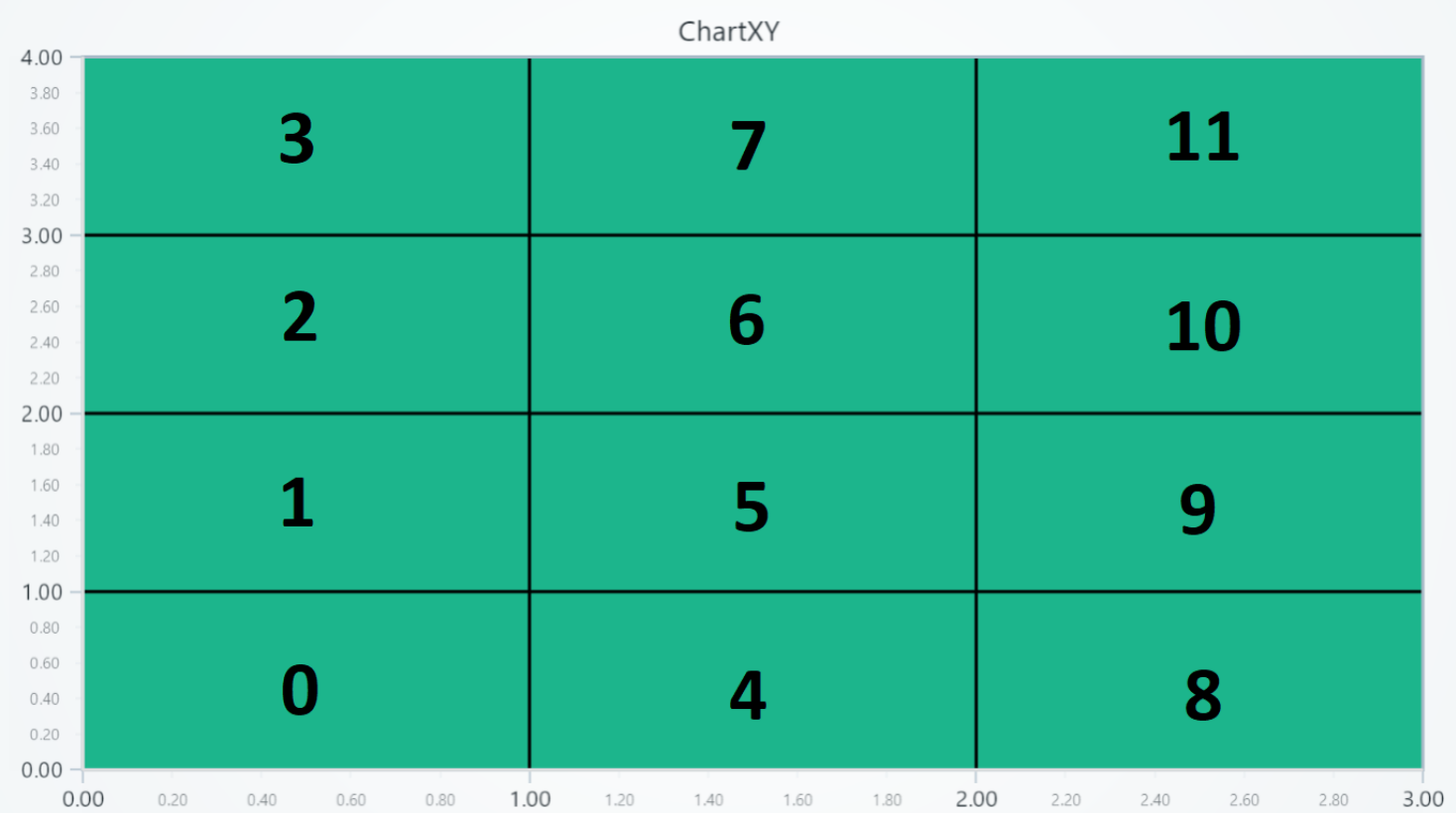
2D Matrix Format:
| column 0 | column 1 | column 2 | |
|---|---|---|---|
| row 0 | 0 | 4 | 8 |
| row 1 | 1 | 5 | 9 |
| row 2 | 2 | 6 | 10 |
| row 3 | 3 | 7 | 11 |
# Define a 2D matrix for intensity values.
# Each inner array represents a COLUMN (not a row)
# Values within each column go from bottom to top (row 0 → row N)
data_matrix = [
    [0, 1, 2, 3],
    [4, 5, 6, 7],
    [8, 9, 10, 11],
]
series.invalidate_intensity_values(data=data_matrix)
Flat Array Format (More Efficient):
import numpy as np

# Flat array - more memory efficient for large datasets
# data[0:4] = column 0, data[4:8] = column 1, data[8:12] = column 2
data_flat = [0, 1, 2, 3, 4, 5, 6, 7, 8, 9, 10, 11]
series.invalidate_intensity_values(data=data_flat)

# NumPy arrays are most efficient (converts to TypedArray)
data_numpy = np.array(data_flat, dtype=np.float32)
series.invalidate_intensity_values(data=data_numpy)
Partial Updates:
# Update only a specific region with flat format (2x2 cells starting at column 5, row 2)
series.invalidate_intensity_values(
    data=[1, 2, 3, 4],
    column_index=5,
    row_index=2,
    columns=2,
    rows=2
)
Intensity Interpolation
# Enable smooth intensity interpolation:
series.set_intensity_interpolation(True)
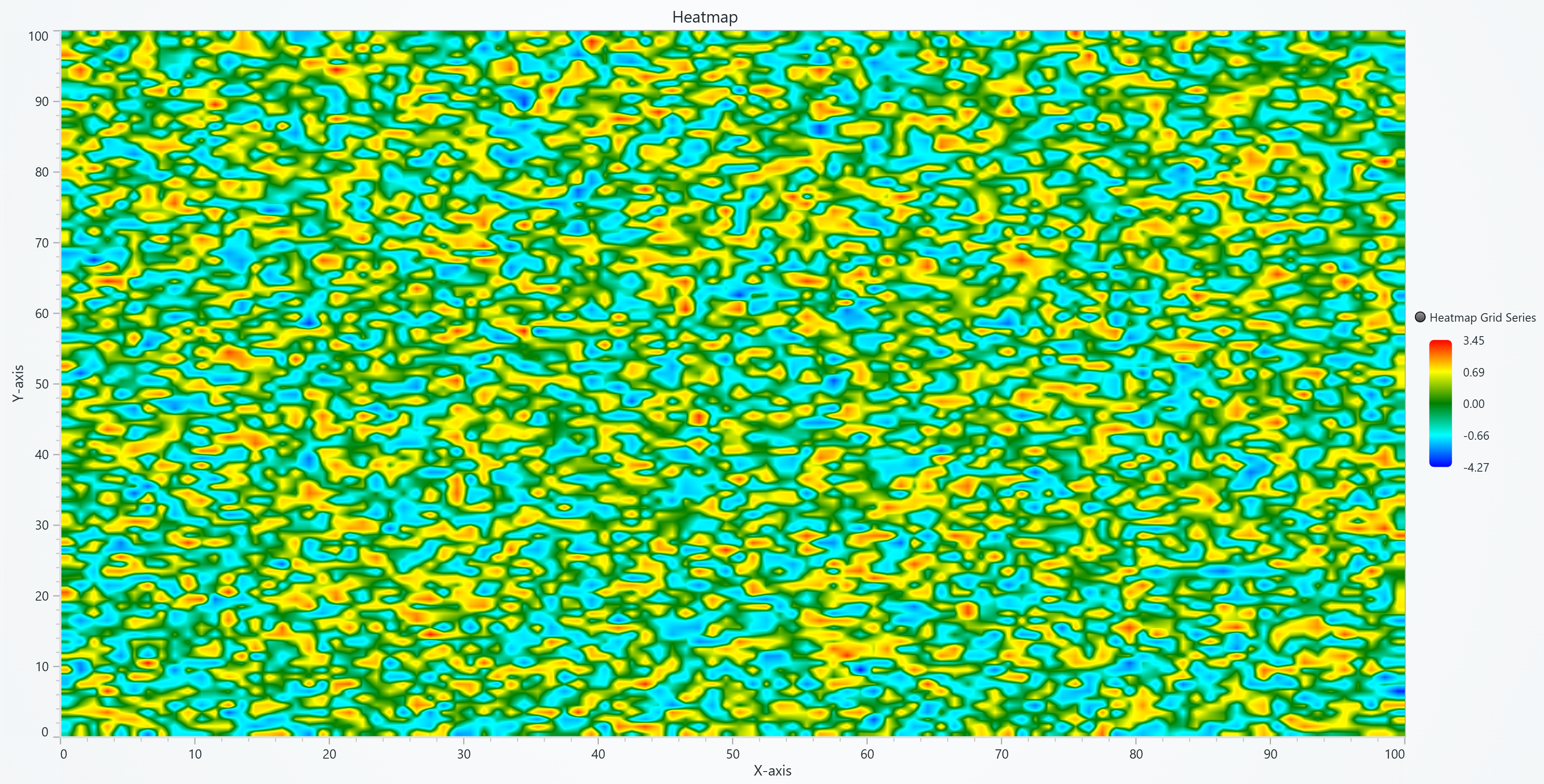
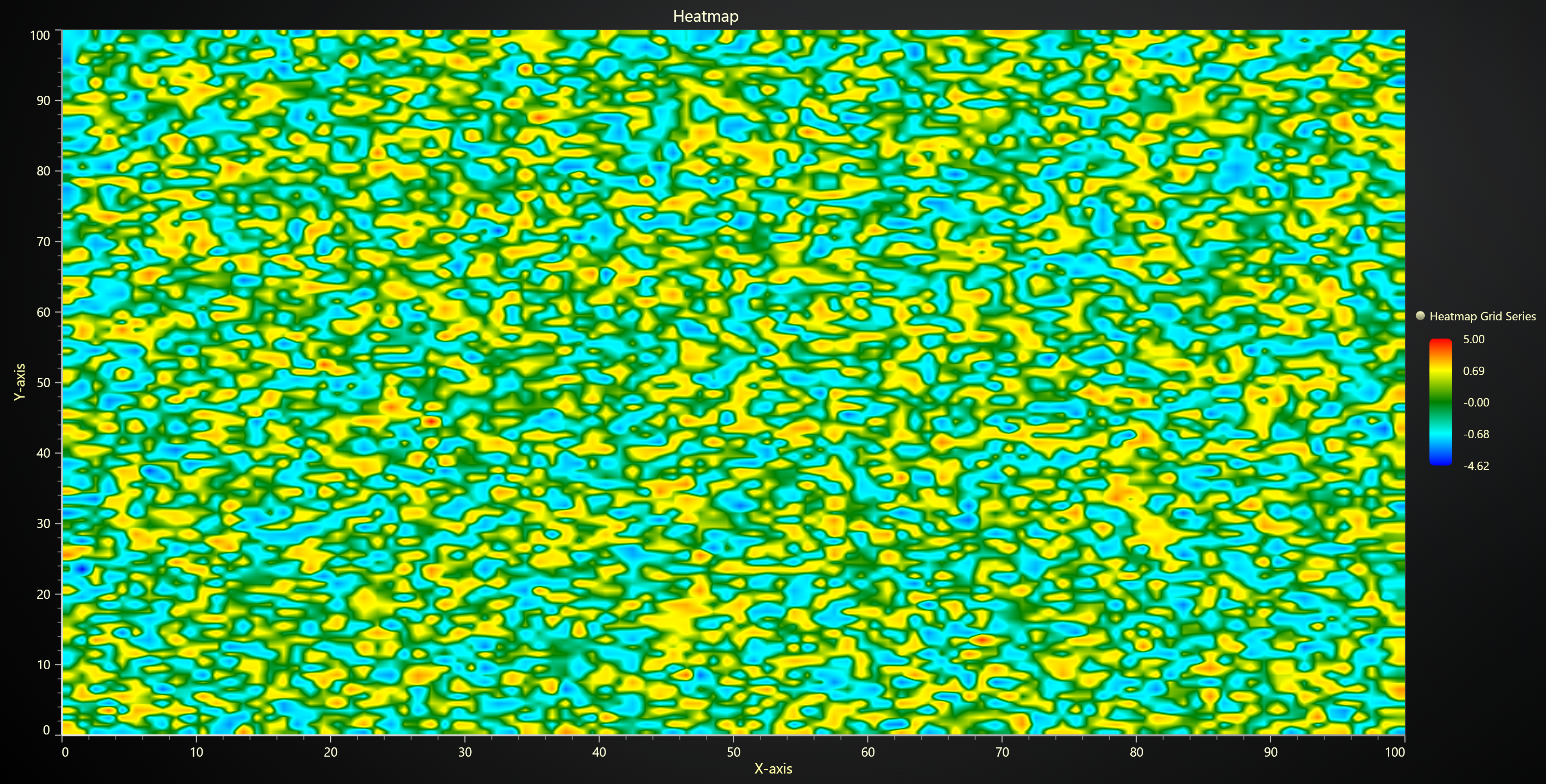
Intensity Aggregation
For dense heatmaps where peak values might disappear when zoomed out:
# Enable max aggregation to preserve peak values
series.set_aggregation('max')

# Enable min aggregation
series.set_aggregation('min')

# Disable aggregation
series.set_aggregation(None)
Aggregation works when intensity interpolation is disabled.
With max aggregation (right), red outlier dots remain visible at all zoom levels, while without aggregation (left) they disappear when zoomed out.
Contour Lines
Add contour lines to visualize specific value thresholds on heatmaps.
Basic Contours
series.set_contours(
    levels=[
        {'value': 10},
        {'value': 50},
        {'value': 90}
    ]
)
Styled Contours with Labels
series.set_contours(
    levels=[
        {
            'value': 25,
            'label': 'Low',
            'label_color': '#0000FF',
            'label_font': {'size': 14, 'weight': 'bold'},
            'stroke_style': {'thickness': 2, 'color': '#0000FF'}
        },
        {
            'value': 75,
            'label': 'High',
            'label_color': '#FF0000',
            'label_font': {'size': 16, 'family': 'Arial'},
            'stroke_style': {'thickness': 3, 'color': '#FF0000'}
        }
    ],
    shadows='#00000040',  # Semi-transparent shadow
    show_labels=True
)
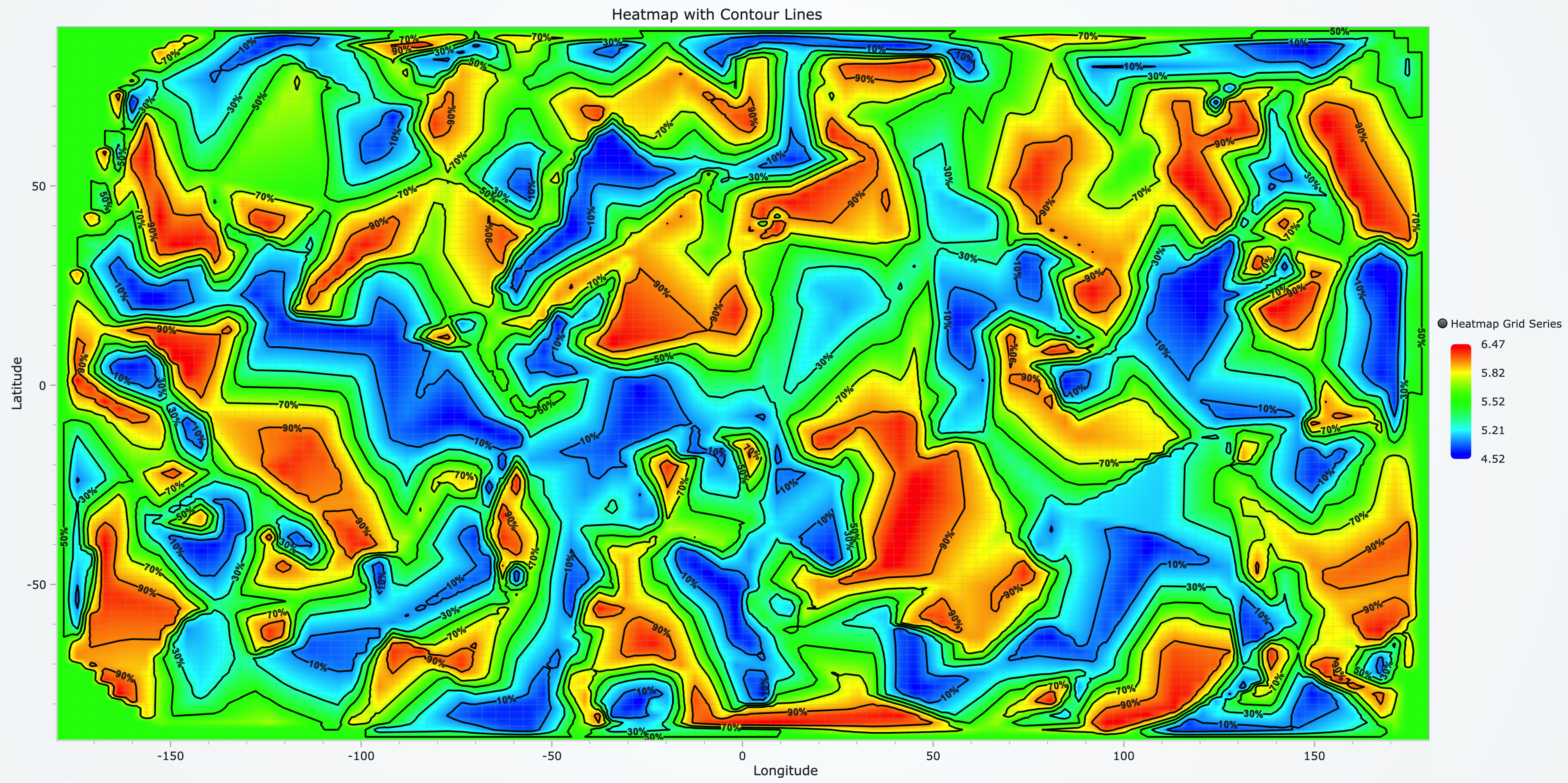
Auto-Generate from Palette
Automatically create contours matching your palette steps:
# First set palette colors
series.set_palette_coloring(
    steps=[
        {'value': 0, 'color': '#0000FF'},
        {'value': 50, 'color': '#00FF00'},
        {'value': 100, 'color': '#FF0000'}
    ]
)

# Generate contours from palette
series.set_contours_from_palette(
    shadows='#00000080',
    show_labels=True
)
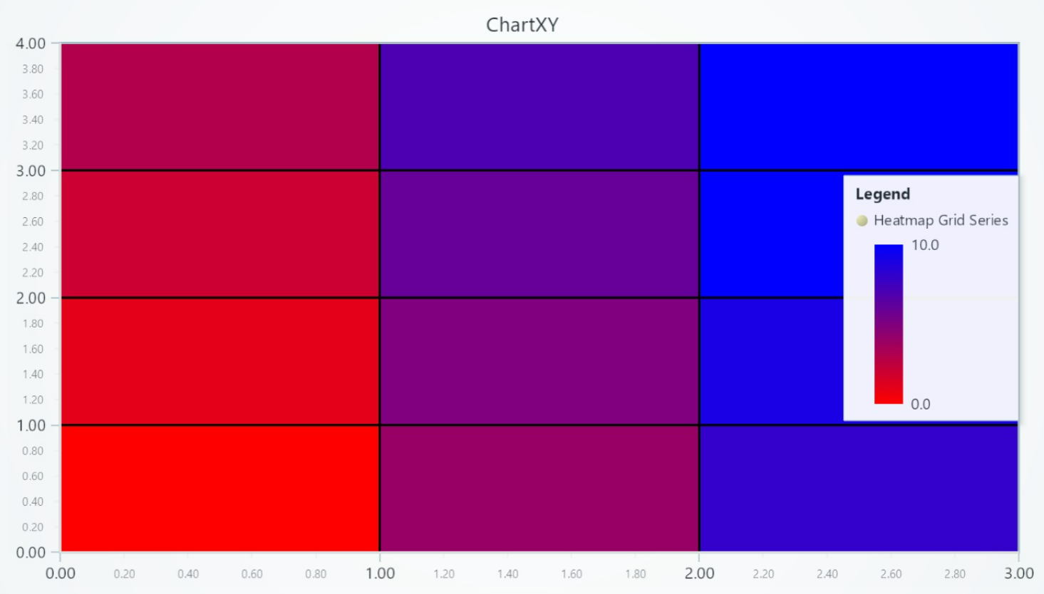
Customizing Fill Coloring
Set Palette Coloring
import lightningchart as lc
# Create a palette that transitions from blue to red:

series.set_palette_coloring(
    steps=[
        {'value': 0, 'color': '#0000FF'},
        {'value': 10, 'color': 'red'}
    ],
    look_up_property='value',
    interpolate=True
)

# With formatted legend display:
series.set_palette_coloring(
    steps=[
        {'value': 0, 'color': '#0000FF'},
        {'value': 100, 'color': '#FF0000'},
    ],
    look_up_property='value',
    formatter_precision=2,           # Decimal places
    formatter_unit='mag',             # Unit suffix
    formatter_scale=1.5,              # Scale values
    formatter_type='scientific',      # 'standard', 'compact', 'engineering', 'scientific'
    formatter_operation='floor',      # 'none', 'round', 'ceil', 'floor'
)
Solid Fill Color
# Set the heatmap fill to a solid red color:
series.set_color((255, 0, 0))
Removing Color
# Remove the fill color:
series.set_empty_color_fill()
Wireframe Configuration
Set Wireframe Stroke
# Set a wireframe with 2px thickness in black:
series.set_wireframe_stroke(thickness=2, color='black')
Hide Wireframe
# Hide the heatmap wireframe:
series.hide_wireframe()
Correlation Coefficient Matrix
For creating a correlation matrix, please refer to the examples under Correlation-Matrix
Legend
Please see common legend section.